| Contributions | Tools |
|---|---|
| Use Case | Figma |
| System Flow | Axure |
| Concepts & Wires | |
| Interactive Prototypes |
Checkout Revamp
use case ⋅ competitive analysis ⋅ system flow ⋅ wireframe ⋅ interactive prototype ⋅ user testing
Project Summary
Checkout Revamp was one of the highest priority projects with the goal of making an overhaul to the entire checkout process that can provide a clear and easy experience no matter the scenarios the user may go through.
Scopes included not just an improvement to the experience but also to incorporate new features, product types and payment methods into our system, which involved a lot of collaboration with 3rd party vendors such as Adyen, Google, Apple, PayPayl and more.
As a main UX lead of these projects, my responsibilities and deliverables included concepts, competitive analysis, use cases, wireframes, system flow and fully interactive prototypes, as well as presentations and discussions with stakeholders, developers, and 3rd party vendors.
Platforms
Mobile, Desktop, iOS, Android
Brands
Foot Locker, Kids Foot Locker, Eastbay, Champs Sports
Regions
United States, Canada, UK, EU
Objectives
Foolproof experience capable of handling any scenarios in easy and consistent experience, as Foot Locker Inc. support multiple fulfillment types as well as the types of products sold. Errors and exclusions, and varying requirements across different countries were all part of the scopes.
One experience for all countries as Web had a different site experience between NA and EU including the checkout process. Maintaining different site experience across the regions was costly and inefficient. App experience had another inconsistency, which only the NA apps had a fully native checkout experience, whereas EU's had utilised WebView to embed the Web version within the app.
Providing more payment options was one of the goals as we only had two; credit card and PayPal. Providing more variaties would allow users to make purchase with their preferred methods or have manageable, comfortable purchase with installment based payments.
Competitive Analysis
Dozen of competitors were reviewed to see what their checkout experience are like:
⋅ Format: multi-page, single-page, modal, bottom sheet?
⋅ Flow: order of completion, numbers of steps, guest vs. signed in, flow variations across fulfillment or item types.
⋅ Layout: fully inline or a mix? Popup or accordion?
⋅ Experience: ease of adding or editing an info, error handling, payment methods.
⋅ Information: how much information or labels are shown, and the level of details on the order and exclusions.
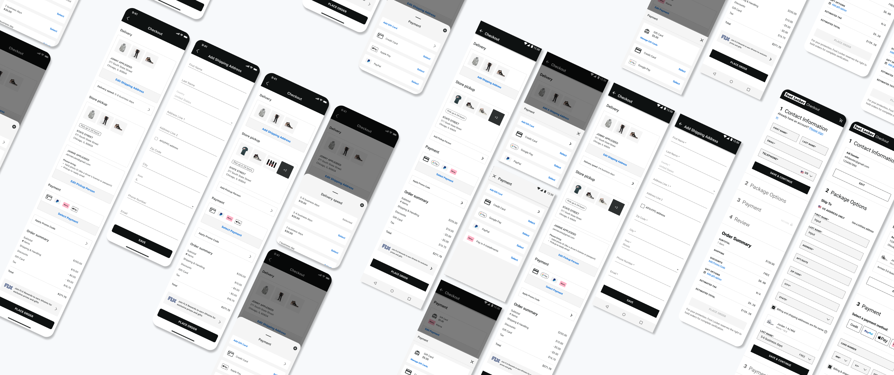
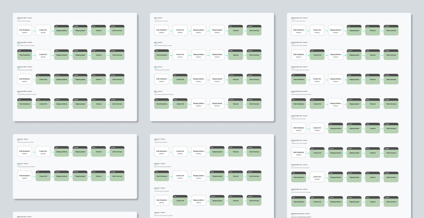
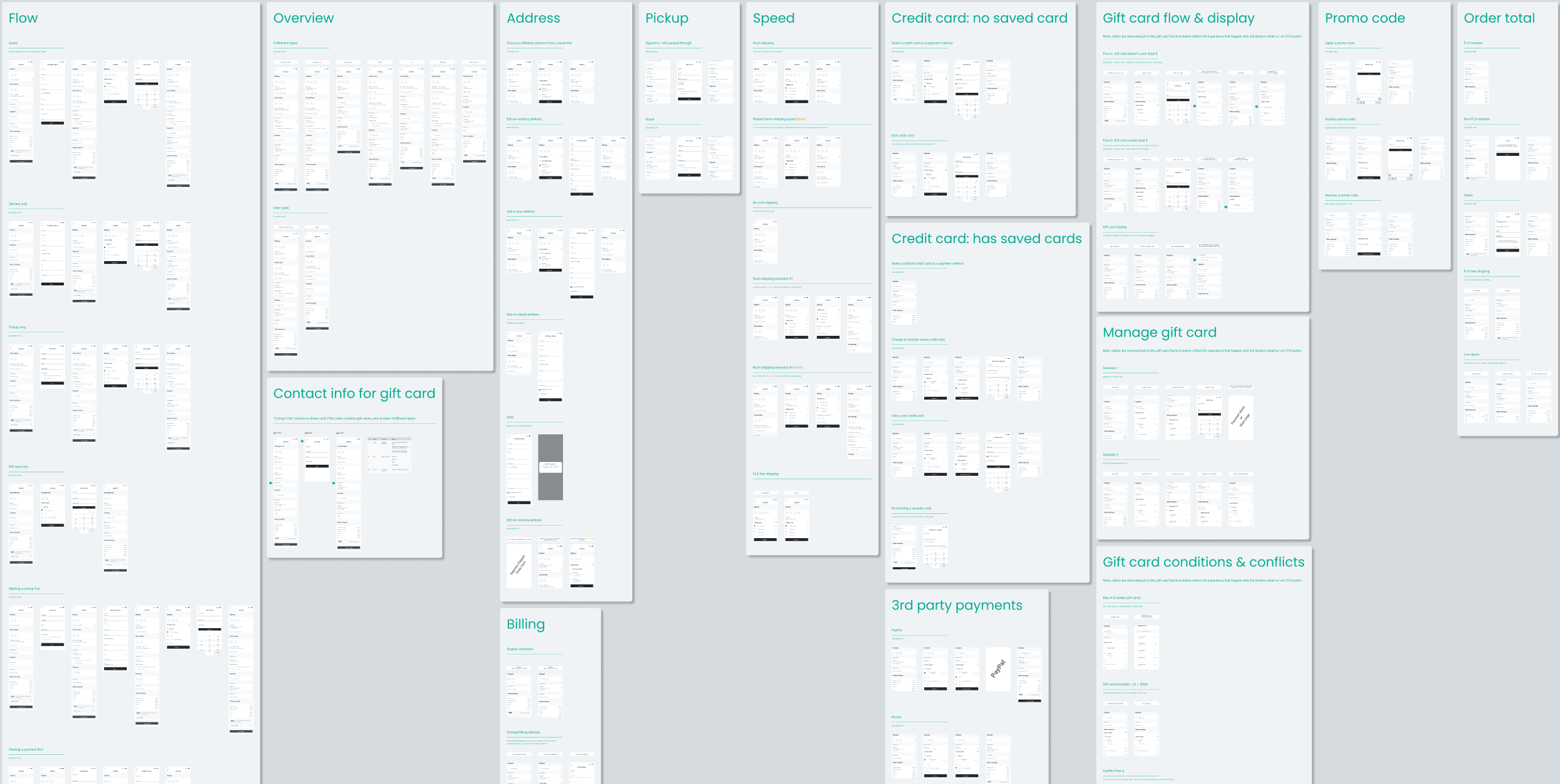
System Flow & Wireframes
Catching all the possibilities that can happen in Checkout was an important step, which came up to 23 scenarios initially and increased further at later phases with added partnerships with vendors such as product types, payment methods, and different sets of conditions or rules that followed.
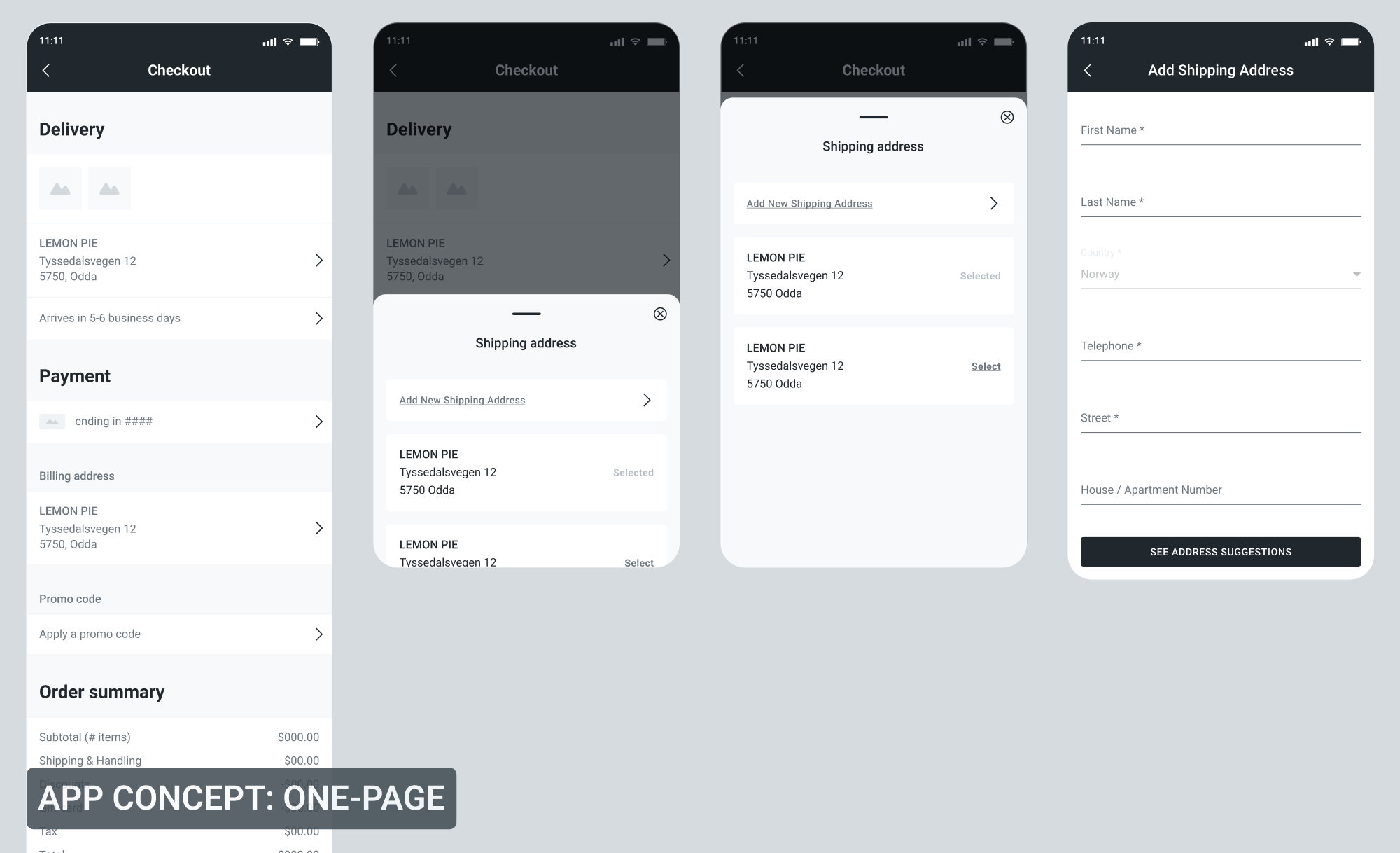
Below is just one example of the wires for the App concept, one-page. As wires are used as blueprints or reference points for our developers, UI designers, stakeholders, leaderships and others we work with, they contain fully detailed info such as scenarios, flows, error states, component and state variations, regional differences across US/CA/EU, and annotations. Wires are also split into separate pages or even into different Figma files based on the platforms; mobile, desktop, iOS, Android.
Wires are also split into separate pages or even into different Figma files based on the platforms; mobile, desktop, iOS, Android. Reasons are because Web and App are handled by different Paths and Product Managers, worked on by different developers specific to platforms, we have separate Figma Components Libraries, and also based off the previous experience of observing and listening to feedback from people accessing our Figma files and the ease or difficulties they feel when navigating our wires or design mocks. Documentation styles is something that I update and experiment often when working on the projects for easier navigation and content digestion.
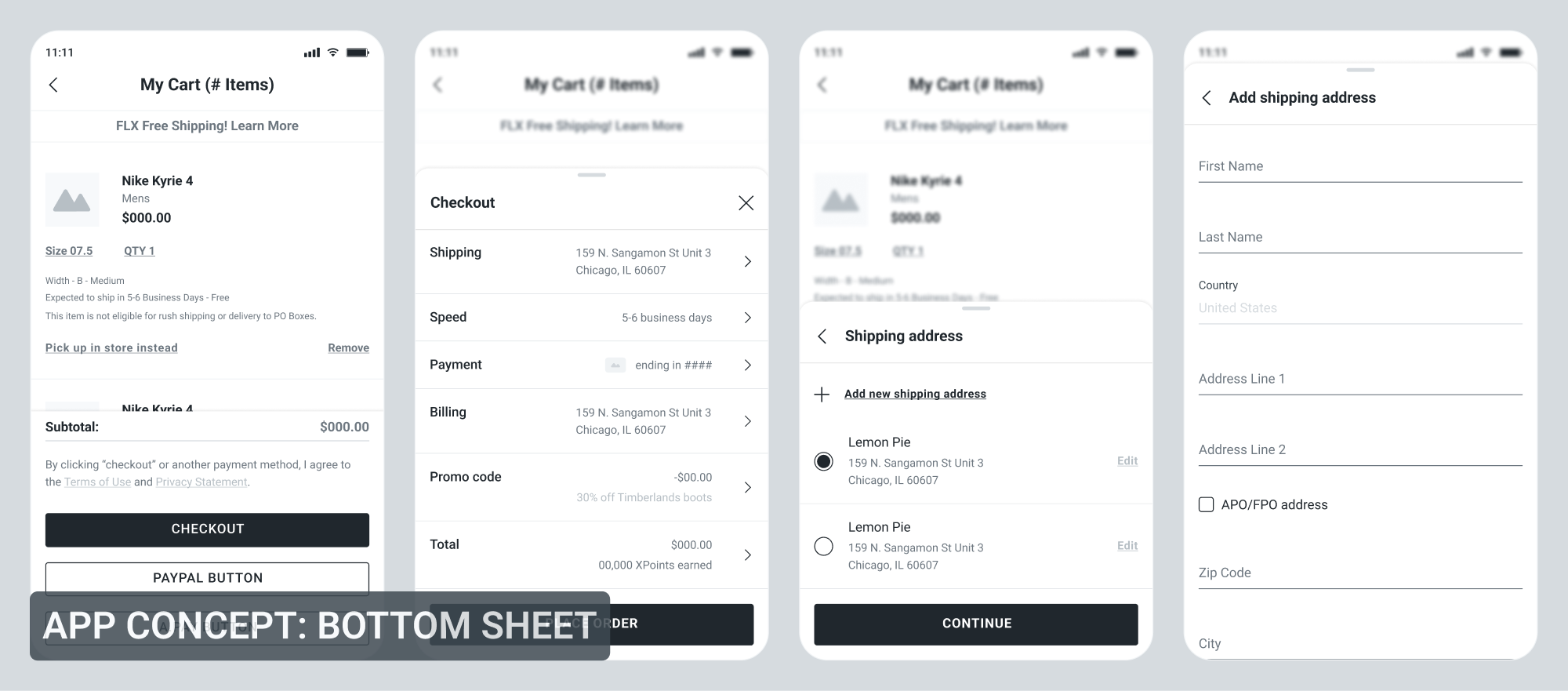
Bottom sheet was a component that became part of our Foot Locker Pattern Libraries that started to be used in many other areas in our apps, not just in Checkout. It was born from the Checkout project, one of my concepts for our new experience as a way of quickly making a selection or edit and get through the checkout steps fast and easy.
As bottom sheet was a brand new experience in our apps with no established patterns and rules, I had several discussions with our iOS and Android developers to review my proposed bottom sheet experience to get thier feedback and inputs on the feasibility and compatibility. iOS and Android each has a native bottom sheet component and its supported behavior and limitations. For example, on iOS the height of the sheet can be dynamic based on its content, whereas Android sheet is fixed at half or otherwise opening in a full screen state at a certain point. Apple's Human Interface Guidelines and Google's Material Design were documents that I've also read through to have better understandings of their native app components and behaviors.
Another step in creating this new component was for me to set up the guidelines and rules on the bottom sheet behaviors, navigation, and scenarios of when or what the bottom sheet should be used for. Setting up the guidelines for new components is a neccessary step in maintaining the consistency and preventing ones from using the component in places that are not suitable. Its final design and styles were born from the collaboration with our UI Designers.
Interactive Prototypes
click to see the prototype
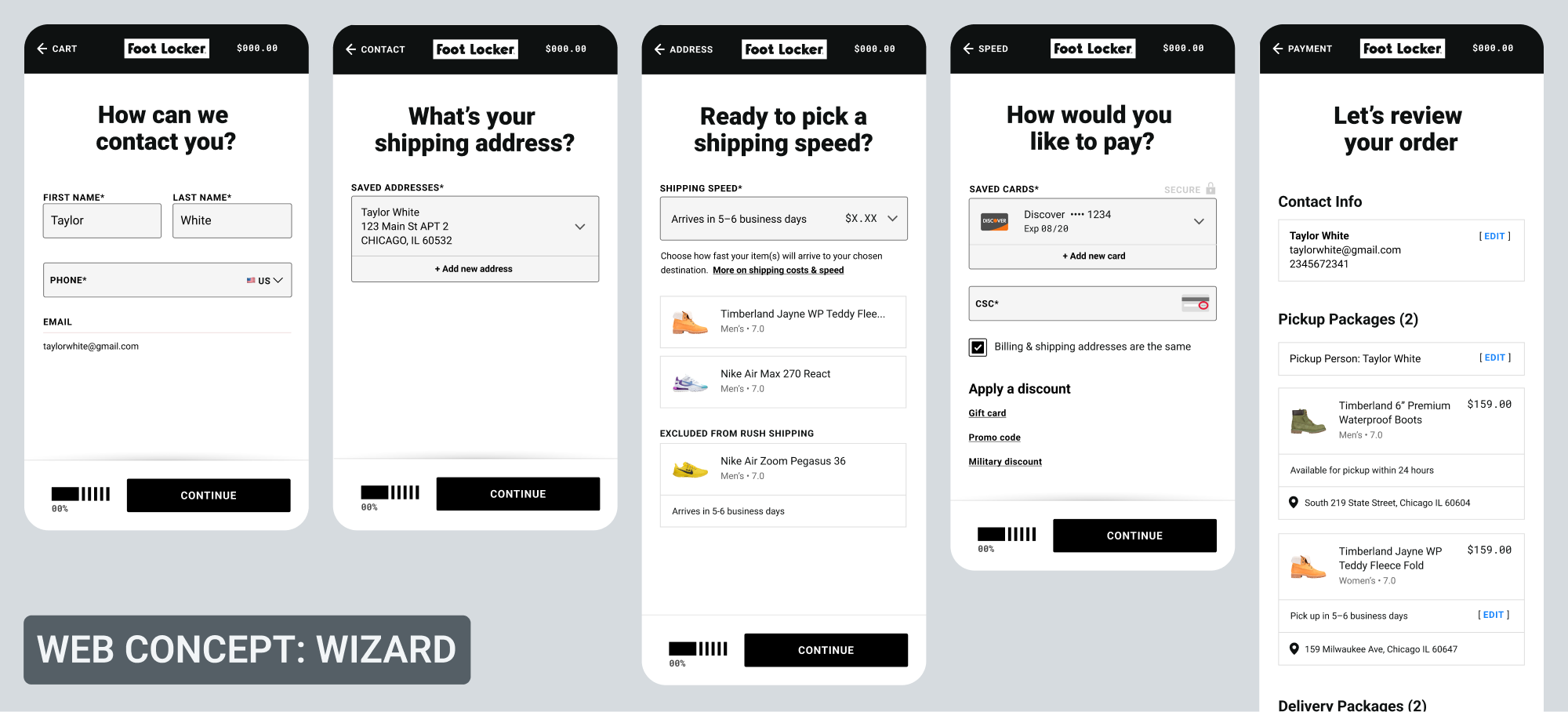
Linked prototype built in Axure is just one of the Web concepts we had which was a multi-page experience. Others included Inline and Exposed which were single-page. Axure is the tool our design team use for building fully interactive prototypes that can emulate actual websites or apps, making it the best tool to provide robust prototypes that allow complex user testing with a lot more freedom and flexibility in test planning and scenarios.
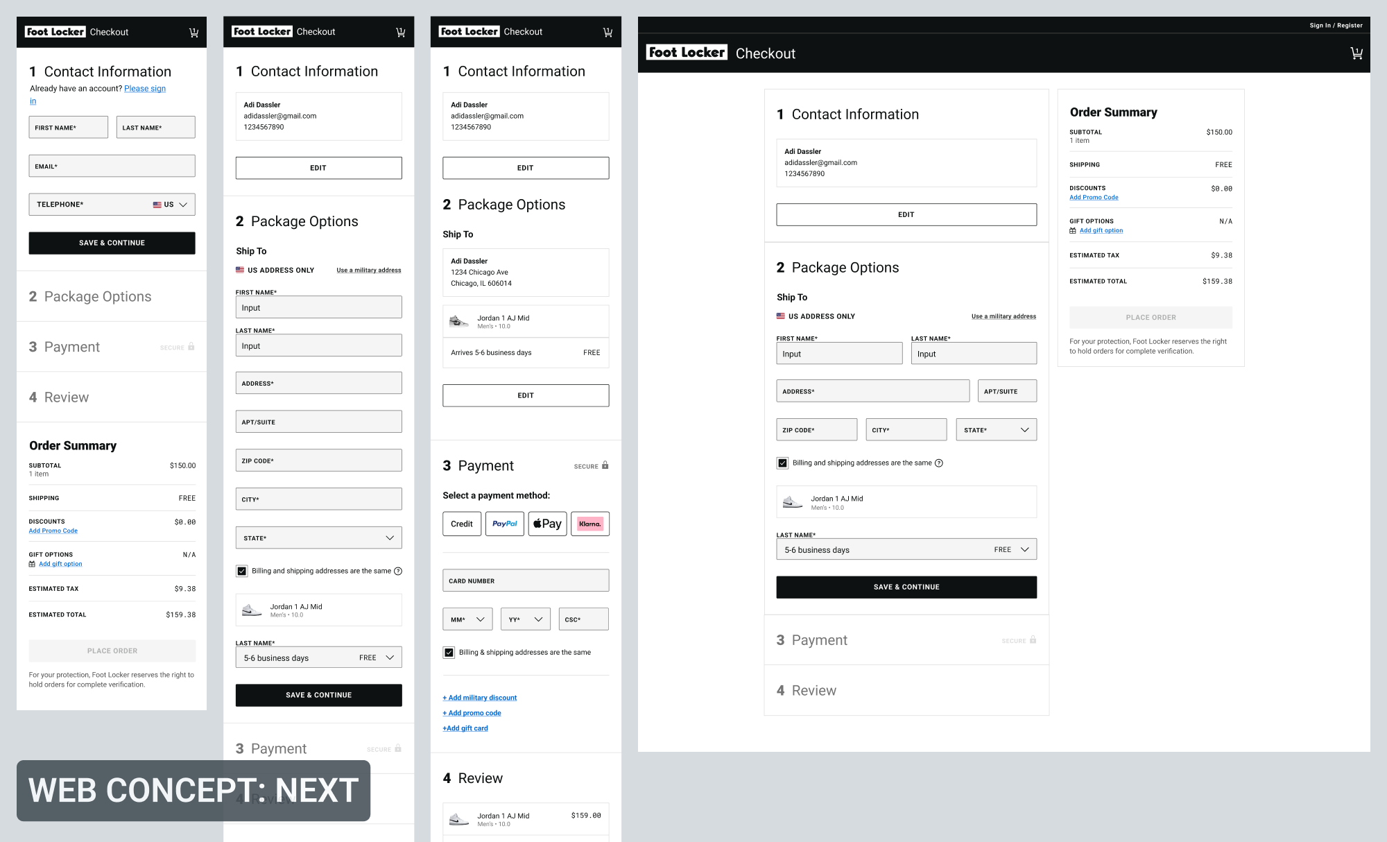
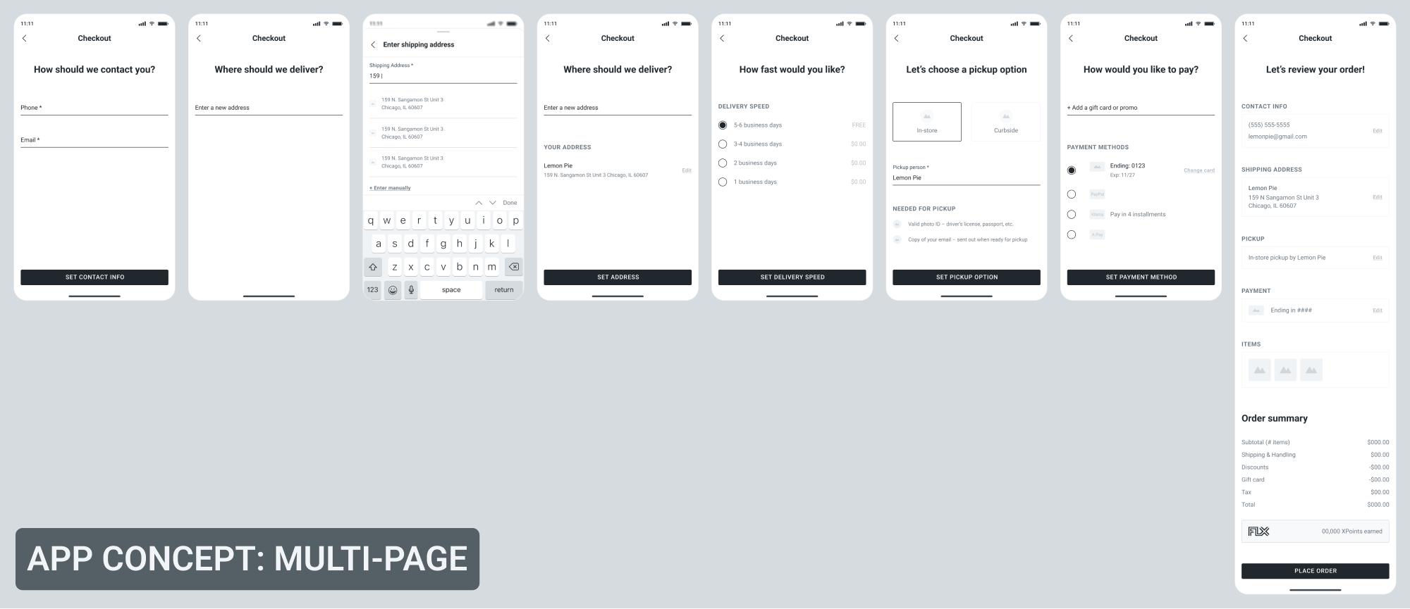
Below are examples of different concepts for Web and App. One thing to note is the timeline difference between the Web and App projects. Web project started earlier in 2019, whereas App project began afterwards in 2021. Two were technically separate projects but I was the UX lead for both.
Challenges
Providing experiences that can handle 23 scenarios and more was a challenging but fun experience especially as its Web project was one of the very first projects that I dove in right after joining Foot Locker. But my personal experience of already working on other checkout projects and having a good knowledge and grasps in all things Purchase helped absorbing everything right away.
Partnering with 3rd party vendors meant each often had a different types of limitations or conditions that we had to follow; sometimes it would be their branding guidelines and other time it would be about the flow or experience itself. We often had meetings with vendor representitives from PayPal, Klarna, Google, Apple and more, where I would walkthrough the wires and ask questions to ensure what's feasible and not. Examples would be if the user can provide payment information within our site or app itself, or if it has to be via the 3rd party portal. If so, at what point of the flow would they have to go through it? Are the informtaion available to our side, or only to the 3rd party vendors as that would impact which info we can display and not.
Communication in regards to partnerships with vendors and contracts was someting that was lacking in transparency. Both our design team and the product manager weren't informed at all of the business going on between the vendors and our business teams, which meant we had no say in the matters at determining which contract or service package to choose from. Packages generally have varying tier levels of different features availability, which have huge impacts on the Checkout experience. Both design and developer teams once had to backtrack and change up part of the experience quite late in the project cycle due to migrating over to a different security vendor without us knowing in advance. Backtracking was something that could've been avoided if we were all included in the business conversation at the beginning, as the vendor actually had a package that would work with our original experience without the need of change.