| Contributions | Tools |
|---|---|
| Use Case | Figma |
| System Flow | |
| Concepts & Wires |
Post Purchase Emails
use case ⋅ competitive analysis ⋅ system flow ⋅ wireframe ⋅ user testing
Project Summary
Post Purchase Emails was the first project I took on after the formation of the new Path, Post Purchase, in 2021 which governs everything that happens post-purchase such as Order History & Account, Emails, Return & Exchange, and more. Foot Locker has numbers of Paths that govern different areas of our sites and apps, and Post Purchase is one of the Paths which I'm a part of as a UX lead.
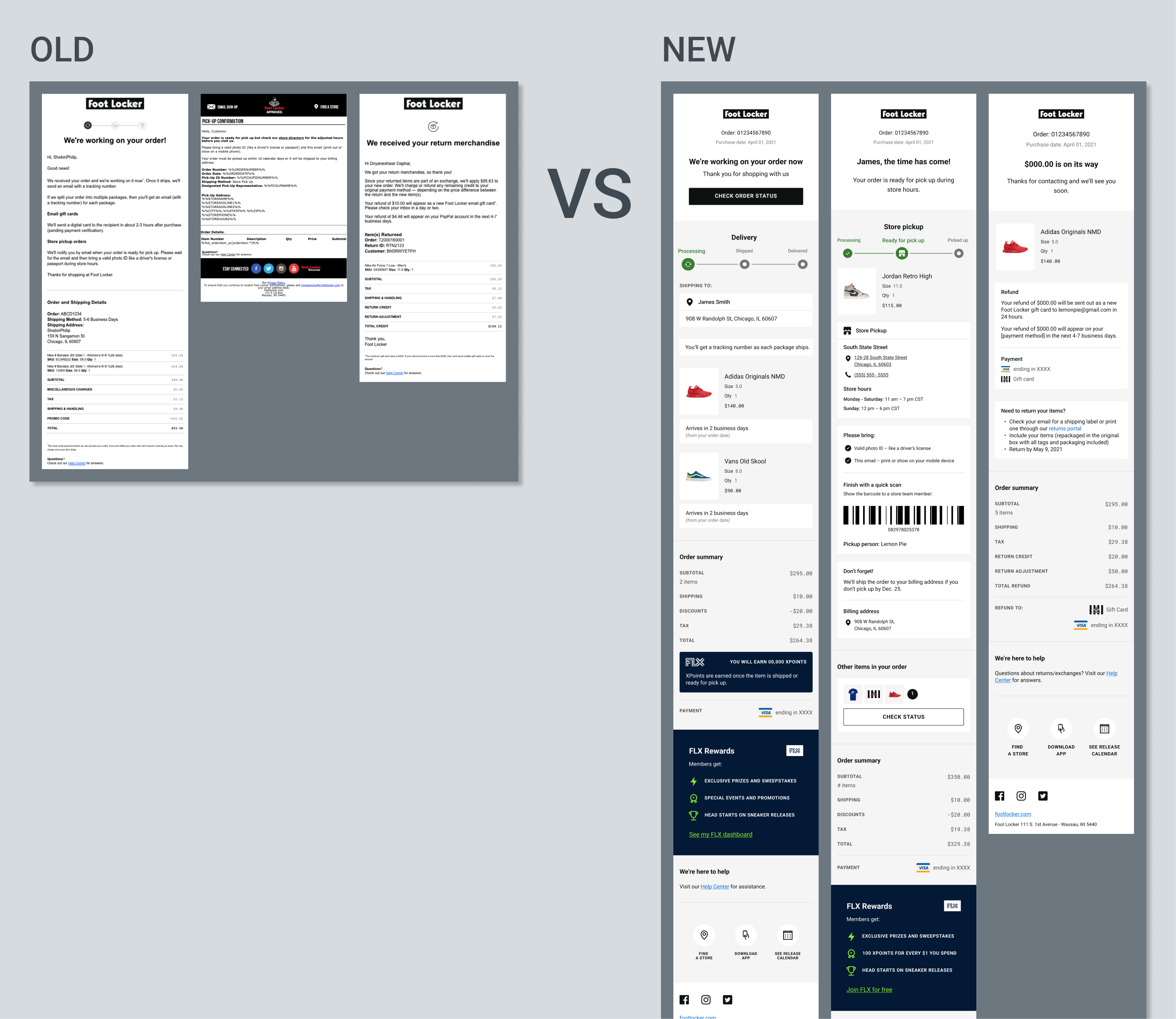
Foot Locker and its family of brands have dozens of email types that are sent out to our customers which many are heavily outdated in both design and legibility. This project was to take a first crack at making an overhaul to the old emails, specifically the post purchase emails.
As the UX lead of the project, my responsibilities and deliverables included concepts, competitive analysis, system flow, wireframes, as well as presentations and discussions with stakeholders and the 3rd party vendor Bluecore that would be building the actual emails.
Brands
Foot Locker, Kids Foot Locker, Eastbay, Champs Sports
Regions
United States, Canada, UK, EU, APAC
Objectives
Redesigning 20+ Post Purchase emails for US, CA, UK and the EU countries which each had different set of legal requirements, features availability, translations, payment system and more that resulted in needing several variations in email versions.
Providing information in a digestable format and introducting a proper information hierarchy was a priority goal as most of the emails were in purely text based format that would overwhelm the users with paragraphs of text devoid of proper structures. Survey data indicated a lot of frustration from the users at having difficulties finding the information they are looking for due to a lack of structure and format, or simply missing some of the critical information.
Uniting all the emails with the new templates to introduce consistency and proper branding identity was a long term goal of this project. Existing emails were previously handled by multiple vendors in addition to not being sure of who was responsible for their designs, resulting in being devoid of any sort of branding patterns.
Competitive Analysis
One challenge that Post Purchase projects often has is the difficulty of studying other competitors' as post purchase experience is something that you can only go through from making an actual purchase. Competitive analysis was made possible with the help from our team, product manager, and directors eagerly pitching in and sharing the emails they've previously gotten from different sites and retails. Focus of the analysis included:
⋅ Content: usage of images and icons, amount of text, balance between visuals and text.
⋅ Info hierarchy: order of information displayed, type of info, level of details.
⋅ Experience: number and type of emails are sent out from making a purchase; order confirmation, shipped, delivered, survey, etc.
System Flow & Wireframes
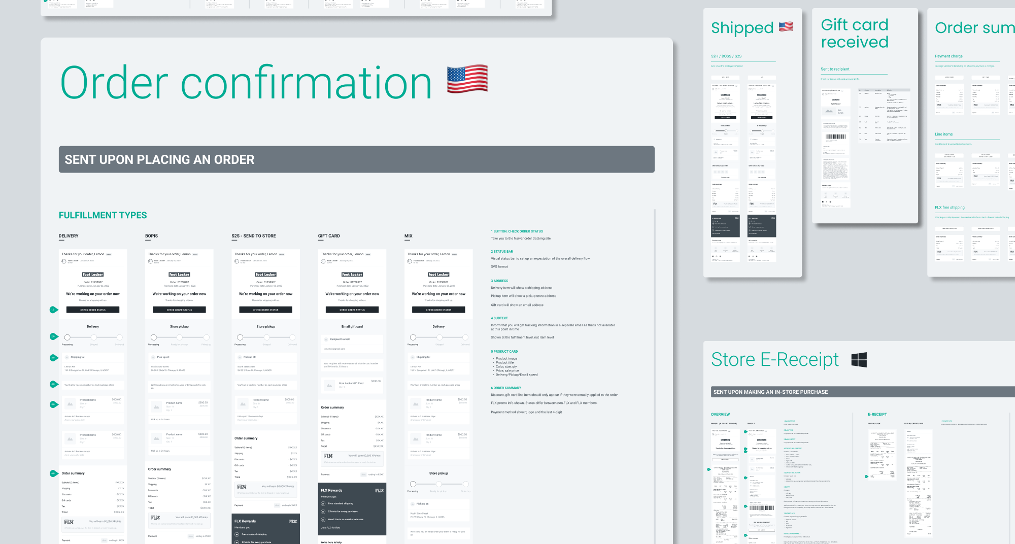
One of the steps to take before diving into wiring out the concepts was to get to the bottom of the current emails ecosystem we had: total numbers of post purchase emails that exist today and each of their purpose, type of emails sent out from a purchase flow and their intervals or conditions that trigger the sendout, any niche emails sent out by edge case scenarios, difference in set of emails sent out based on the fulfillment or product types.
Finding out such answers to the checklist involved us Product Manager and I reaching out and connecting with the managers and directors of different teams within the Foot Locker organization such as Customer Service, Store Experience, DTC (Direct to Consumer) Fulfillment.
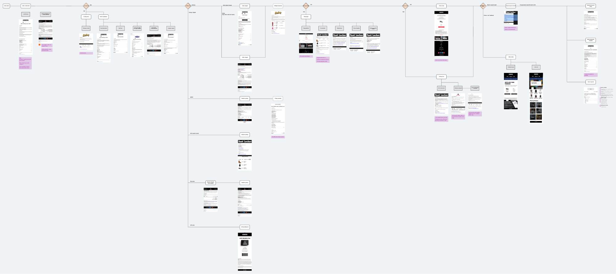
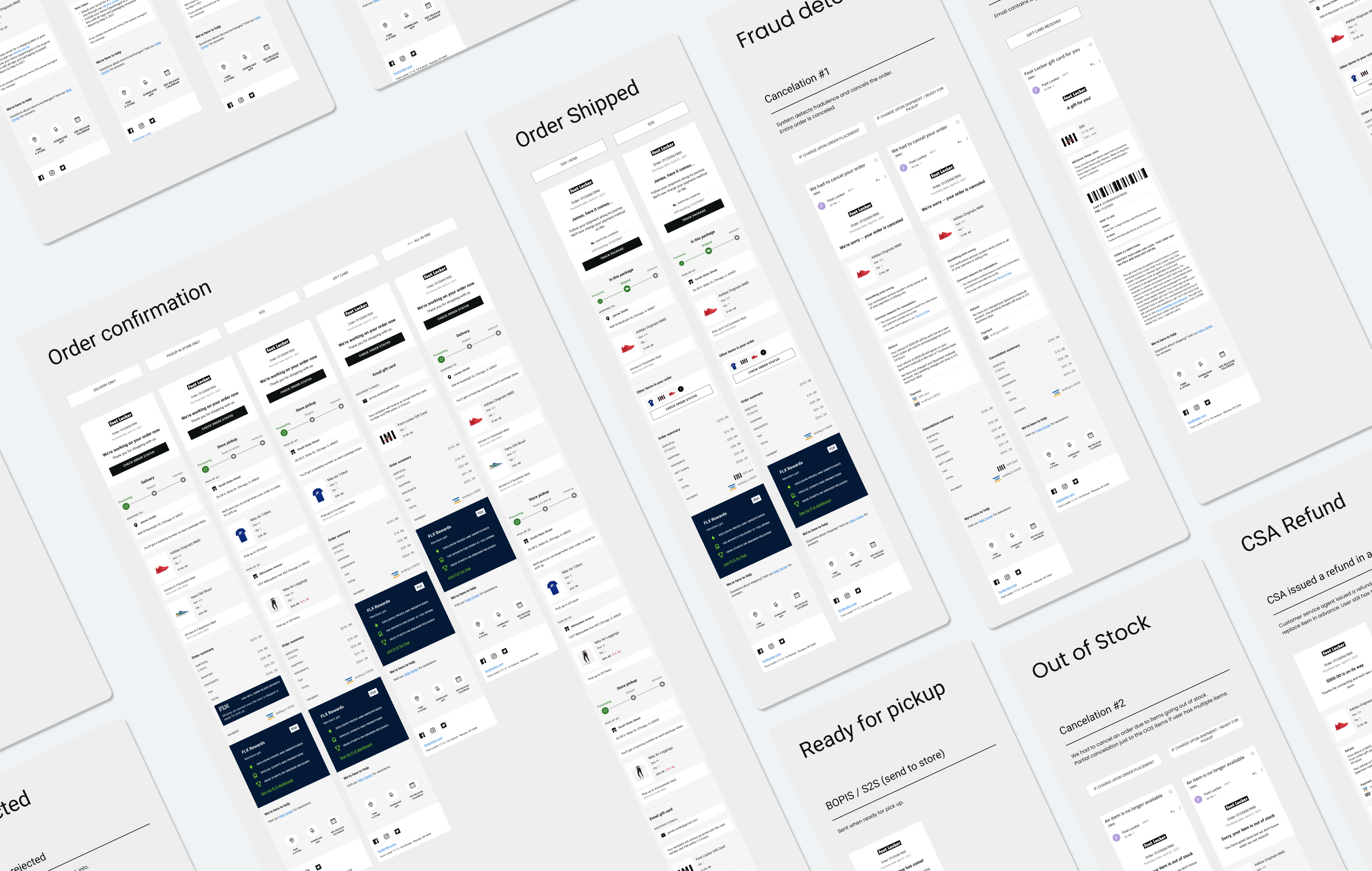
As redesigning and deploying 20+ types of emails all at once was going to take a huge efforts from all parties involved, we first sorted the emails by priorities; which ones are the most important emails or sent out the most? Which ones are in dire need of improvements based from the survey data?
Order Confirmation, Shipped, Delivered were the three I started with as they were the most sent emails according to data, but that didn't mean those were the only things in my mind. There were still a dozen of other emails such as Pickup, gift card, cancelation, return & exhcnage and more, and I was aiming to come up with the designs that can handle all those different content types.
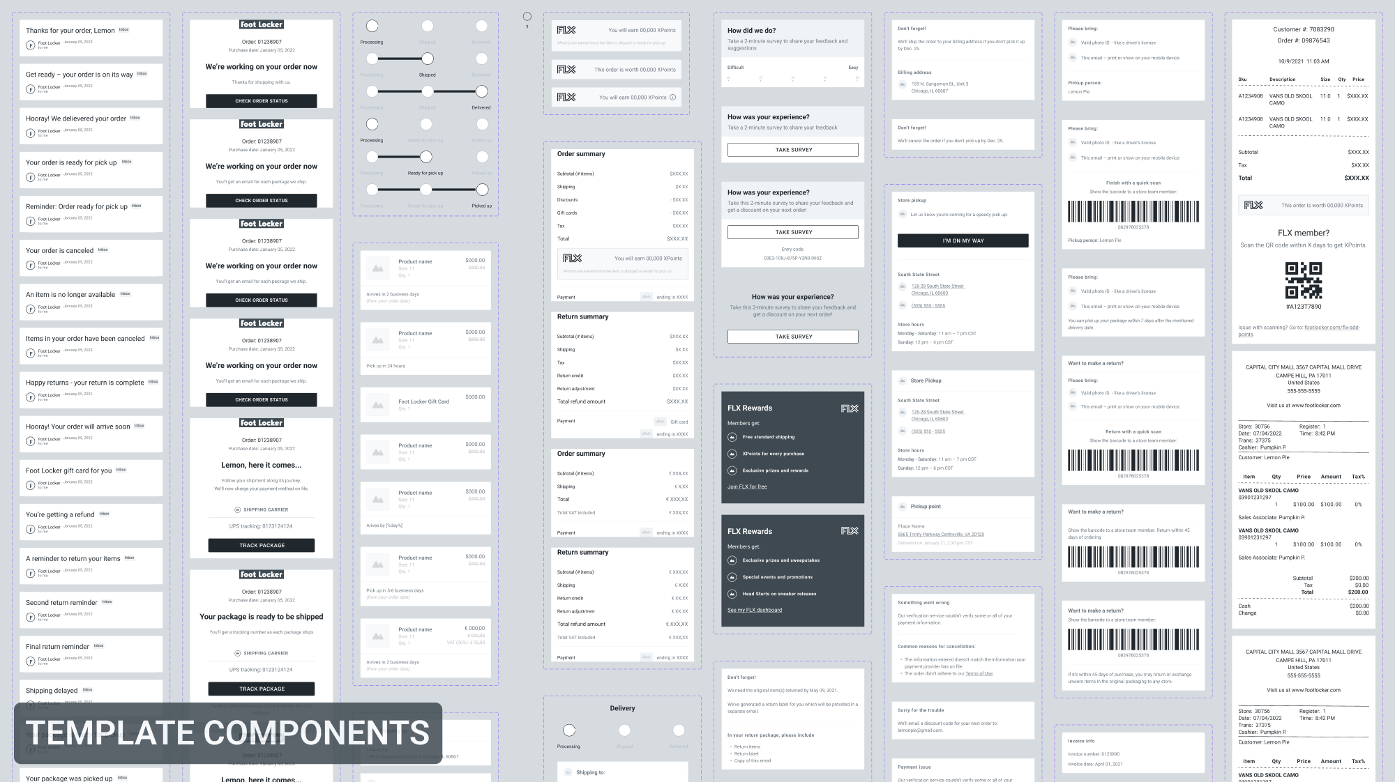
Modular templates and components were the outcomes that fulfilled that goal, which were designed to easily plug in and out the content components as needed. Each component and its variations maintained the same patterns, and its placement order and location within the templates were designated as well, which would allow consistency in both design and exprience across all the email types. Examples of the components include:
⋅ Header & Title section for order number, tracking info, CTA, and copy variations of title and subtext of different email types.
⋅ Address component and its variations that can display shipping address, store pickup location, or email address depending on the fulfillment type.
⋅ Product card of varying states to handle product types and other conditions such as discounted price, or VAT in case of EU, or even a state if the product image were to fail to load.
⋅ Quick Links & Help section that show different web links and subject matters based on the email types, brands, or region.
Setting the grouping logics was an important task in displaying information in clear and digestable manners. Foot Locker features multiple product and fulfillment types; Ship to Home, Ship to Store, Ship from Store, Buy Online Pick Up in Store, Digital Gift Card.
Each five goes through a different checkout process and has different set of information tagged on to, which brings a question of what would be the best way to display all these different product types and their info in the email if an order contains a mix or all of those items? And what could we do to remove the repetitive information that may be shared across some of the items? Some may not be likely scenarios to happen but taking every possible scenario into account is an important step in providing a fool-proof experience.
Challenges
Accounting all the major and minor differences in the emails was a pretty challenging and time consuming experience, which involved a lot of tracking and communications with multiple teams in the organization. Factors included:
⋅ Brands: Foot Locker has multiple brands such as Kids Foot Locker, Champs Sports, Eastbay, and Footaction, each with a different branding guidelines, policy & legal content, links, contact and address info.
⋅ International scopes: US, UK, Canada, and a dozen of EU & APAC countries with varying business systems in payment and return & cancelation, supported languages & translations, presence of apps.
⋅ Products, fulfillments, types of order: varying set of information and copy to display.
Back & forth feedback and VQA sessions with the email vendor as their developer team was the one to build the actual emails based off the UX/UI mocks and documents provided by us in Figma. Theoretically, sharing the Figma file with them should've provided all the accurate design specs such as font family, size, styles, paddings & margins, and color codes, because Figma offers an ability to inspect all those attributes and that's also how we deliver to our own developers in all other projects. But the 1st draft they've shared with us had quite a lot of notable discrepancy, which we've then provided new sets of documentation highlighting all the elements and parts that are off and detailing down what they should be.