| Contributions | Tools |
|---|---|
| Components Creation | Figma |
| Updates & Maintenance | Axure |
| Guidelines | Trello |
Figma & Axure Component Libraries
Mobile ⋅ Desktop ⋅ iOS ⋅ Android
Project Summary
UX Component Libraries was a side project myself and one other UX Designer collaborated to provide UX libraries containing individual prebuilt components as well as full-page templates for us UX Design team to use in our wires and prototypes.
Scope was to cover all platforms mobile, desktop, iOS, and Android for both Figma and Axure. Figma is what our Designers use for wires and mocks, whereas Axure is primarily used for creating fully interactive prototypes that are used in user testing.
This project started pretty early on after joining Foot Locker, partially as an exercise to familiarize with the existing branding guidelines, and also because our UX team didn't have such libraries in place, resulting in having inconsistency in the UX deliverables across the Designers in terms of its fidelity or styles. Use of libraries would also increase productivity as it would require less time creating wires.
Figma
Text styles, Colors, Icons & Logos, Components, Full-page Templates
Axure
Text styles, Colors, Icons & Logos, Dynamic Components & States, Full-page Templates
Objectives
Drag & drop component libraries for Figma and Axure in all platforms mobile, desktop, iOS and Android, which would allow every UX Designer to provide wires and prototypes faster than starting from scratch. It would also introduce consistency in fidelity and styles.
Long term maintenance of the libraries to keep them up to date, updating with any new components or design. Figma libraries in particular were given overhauls in 2022 with the introduction of Auto Layout and Variants, which were the new features in Figma that made it even easier to create and maintain wires or mocks.
Pixel perfect, accurate design specs that match to the branding guidelines. Each designer has their own preference and not everyone used the accurate specs in their wires such as font size, spacing, alignment and style. Component Libraries would ensure more accuracies in that regard, which would also prevent miscommunication or confusion between UX, UI Designers and Developers.
Dismentling the Site & Apps
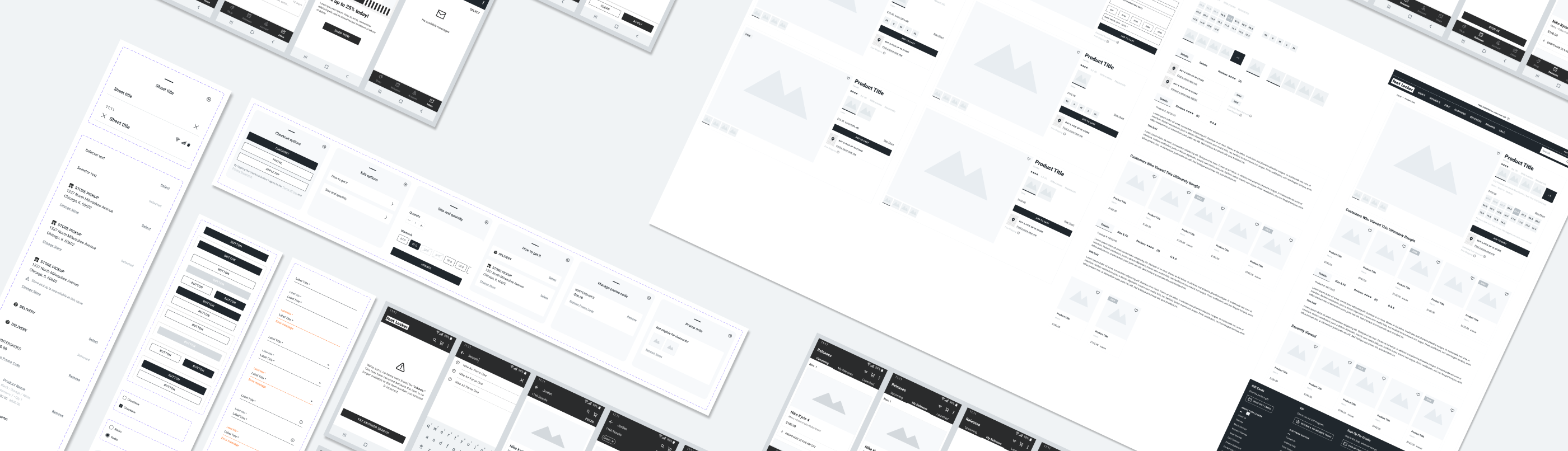
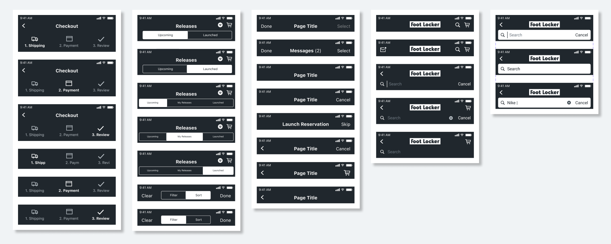
First step in creating the component libraries was to audit through every nook and cranny of our sites and native apps and list out all the components & variations, icons & logos, error states, and scenarios that happen in existing screens & experience such as Checkout, My Account & Orders, Launch Reservation, PLP, PDP, Cart, Home, Membership and more, including the AEM (Adobe Experience Manager) portal.
Next step was to sort the cotent on the list and determine the priorities so we can start out with the components and pages that are most often used. They were also grouped into categories which would impact the way we set up our libraries and how the components are searched and found in those when the users, us UX Designers, are using our libraries. Example would be deciding whether to group the components by the page they are used from such as Checkout, or by their natures such as grouping all the CTAs into Buttons. The way we group and split the components in Figa or Axure would result how they are shown and found in the Assets list when using the libraries.
Auditing the sites and apps had another benefit of gaining insights in everything that's in our sites and apps, branding guidelines, and both parity and disparity between platforms. That was a great knowledge to have as our designers are normally assigned to specific Paths and may not have much knowledge outside of theirs.
Building the Components
One of the guidelines we set was the dimensions. A quick research was conducted to see the most commonly used device dimensions, and following were the decisions we've landed on: 375 x 667 for Mobile & iOS, 360 for Android, and 1440 for Desktop. Average size of the mobile devices was getting bigger but 375 and 360 would ensure that any new design and experience we provide will look and work as intended even on smaller devices.
Each component had varying states and variations to cover. Header is an example that has different title copy, navigational elements and icons depending on the screen or the flow it's from. Having just a single drag & drop Header that you can swap to whichever version you are looking for would not only save time but also ensure the design we pass over to UI or Developers is correct, as one may not always remember the correct version and provide an incorrect design such as using an X icon instead of a chevron.
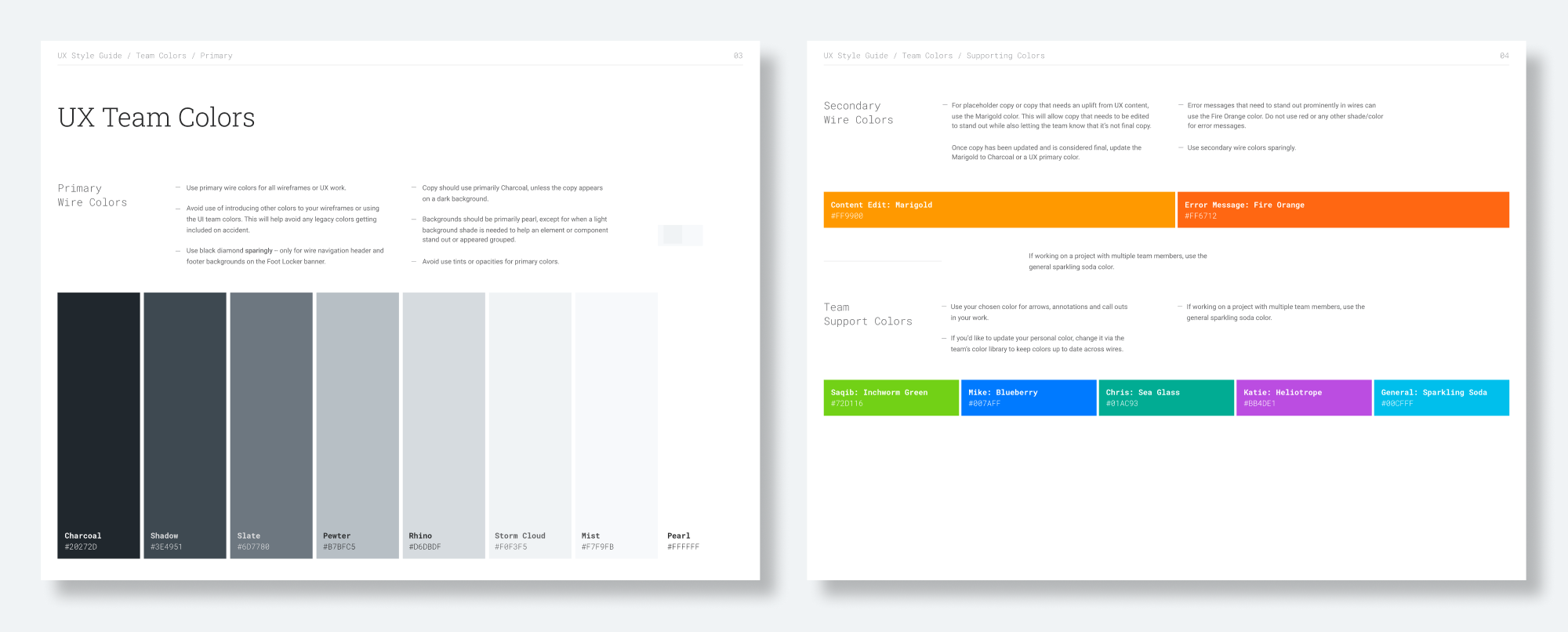
Color Palette was another we came up with for the UX libraries. Design team is split into UX and UI, which UX provides wires and UI delivers a finalized design. There have been a number of confusions in the past where the developers or others looking through our files would mistake the UX wires to be the final design and use that as the base. Color Palette was one of our ways to make the UX wires and UI mocks easily distinguishable. With it the UX wires would be in customized greyscale theme in contrast to fully colored UI mocks. Each color was assigned to specific use for consistency; Charcoal for primary and Slate for secondary text as an example.
Release & Maintenance
Component Libraries didn't stop at the 1st release. It was something that we updated periodically to add new components and update any screens that have since changed. Implementing Auto Layout and Varaints were the latest updates we've made as those were new features in Figma introduced around 2022, allowing a much flexible designing experience as well as an easier maintenance of the components and templates. Auto Layout is a feature that automatically reposition or adjust the content inside a layout based on the settings you assign to it. In a way it's similar to how a responsive website adjusts to the viewport or a browser size while maintaining all the paddings, margins, and the overall layout. Variants allow a cleaner setups of the component variations which also makes it easier for the library user to find and use the components from the Assets list.
In addition to the Component Libraries which are used by the entire UX Design team, I had my own personal libraries as well that were more specific to the individual projects I worked on. These would contain new components and templates that came out of the new projects but are yet to launch live. They were also my playgrounds to experiment new styles of library setups.
After our initial release, Figma libraries became the main focus in keeping it up to date as opposed to Axure's due to a lack of needs to have prebuilt components in Axure. One of the reasons is because Axure is only used when creating interactive prototypes for user testing the new concepts, not the existing experience. Another reason is because of the Figma plugin that allows you to export the wires and mocks in Figma into Axure as widgets, removing the need to create designs in Axure from scratch.