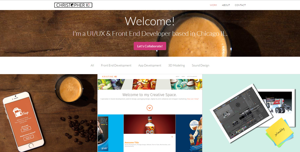
New Responsive Website
A brand new portfolio website that I created to replace my older version. Different from my previous website, this new site was created with a flat & fully responsive design in mind.
web development ⋅ web design ⋅ Brand Design

A brand new portfolio website that I created to replace my older version. Different from my previous website, this new site was created with a flat & fully responsive design in mind.
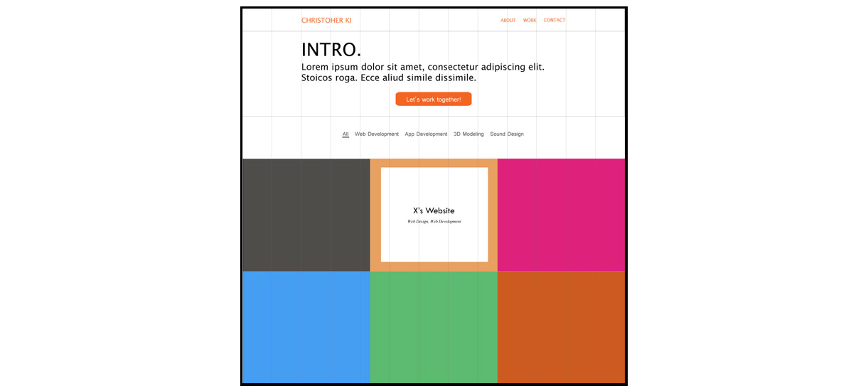
To have a clear goal for the design and layout for my new website, I created a simple prototype for the index page via Adobe Illustrator CS6 before jumping into HTML and CSS first.
Rather than using plain text or pre-made vectors, I wanted to add my personal brand or logo that could represent me, and add more styles to my website. And what's better than making them myself to accomplish that?
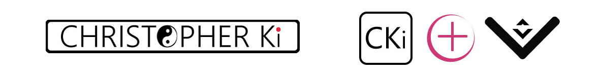
Brand & Favicon: As a trilingual who can speak English, Korean & Japanese, and having experience of living in multiple countries, I wanted to add some kind of an emphasis on my website that tells that I'm familiar with both Western and Eastern cultures. After a bit of thinking, I came to a conclusion that it would be best to make use of my brand logo for that purpose. As its position is fixed on top of the screen, the brand logo will have the most exposure to the visitors' eyes out of all elements that's in my website. I decided to use yin-yang symbol as it's one of the well known symbols from Eastern cultures. The word CKi comes from my name: C from Chris and Ki, which is my last name. cki also happened to be my username in college, which I became fond of.
JS scripts used for any responsive features in my website were hand-coded personally by me. CSS was used to add detailed styles and layouts.
Thumbnail Hover Effect: Scripts were written to display its title & caption. Although it might look simple, it acutally consists of numbers of elements such as title, caption, icon, and a white background block. Every mentioned element requires different CSS properties and values for its positioning and styling, which can be a bit complicated than it looks. Another challenge was to keep their positions and proportions in place upon screen resize.
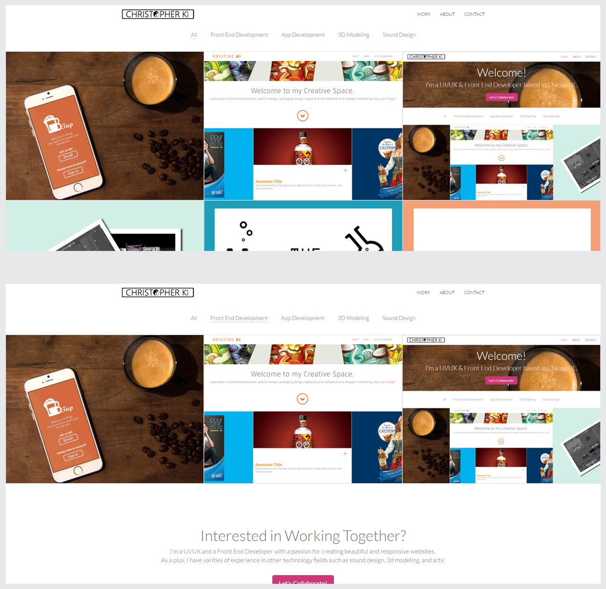
Thumbnail Gallery Sorting: Thumbnail gallery displays a different set of thumbnails based on which button a visitor selects. There are five buttons: All, Front End Developemnt, App Development, 3D Modeling, and Sound Design. Selecting any of the button changes the display of the thumbnails on the spot, without having to reload the page. Below photo shows the difference in display between selecting All and Front End Development.
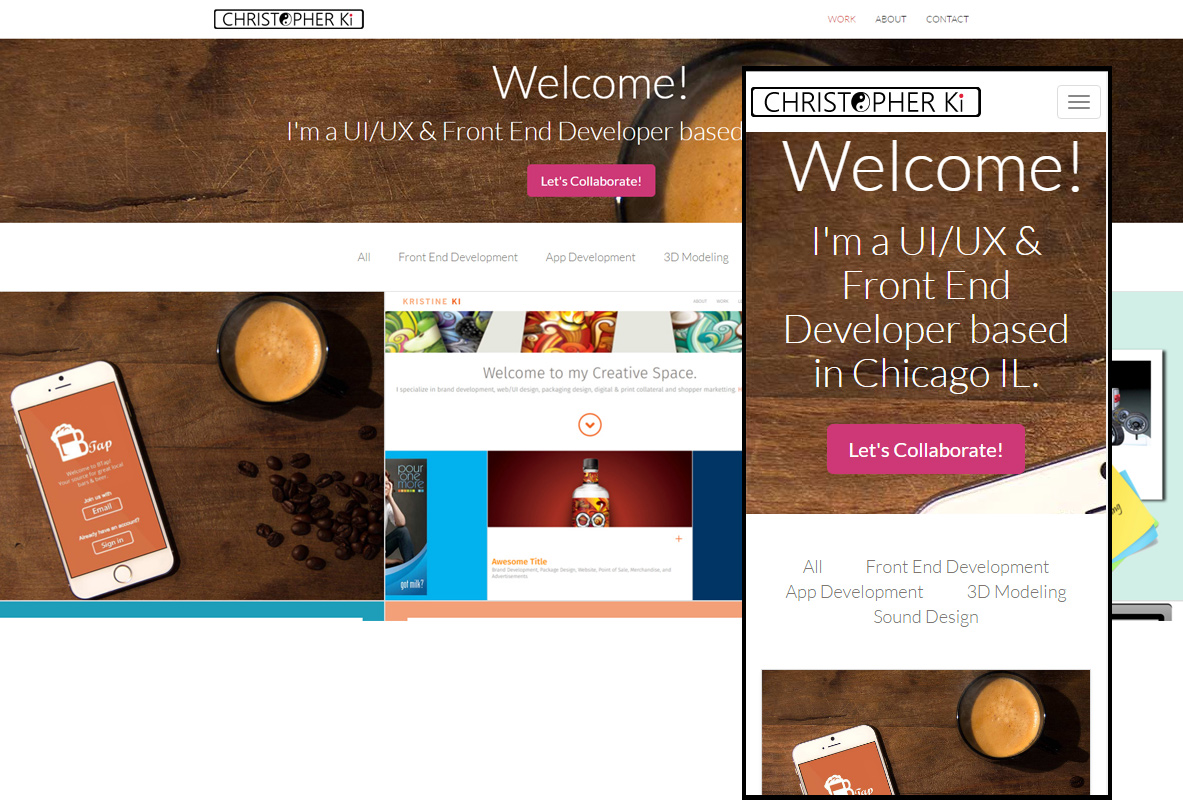
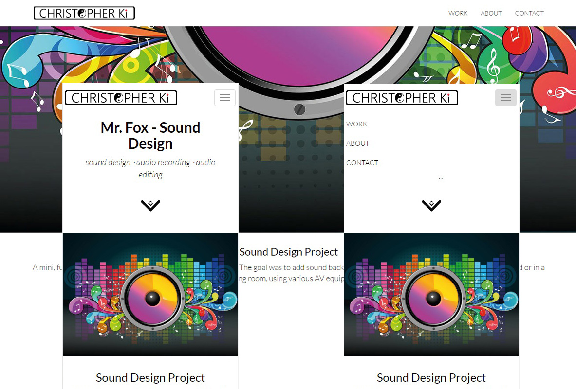
Sticky Navbar and Dropdown Menu: To keep the navbar visible and accessible at any time, I made the navbar stick to the top of the screen so that it would follow along the screen even when the visitor is scrolling down the page. On a smaller view, navbar links are collapsed and changed into a dropdown menu style to keep the view clean and simple.
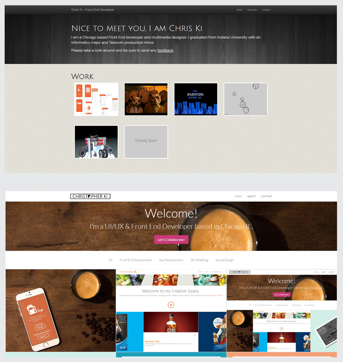
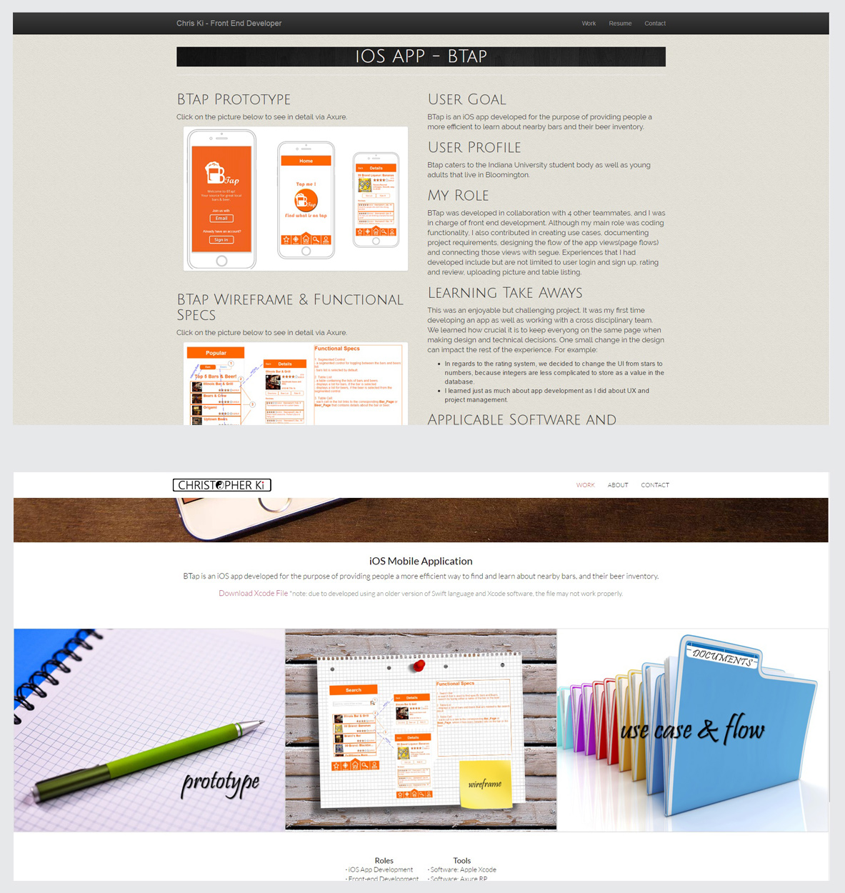
Below are the few examples of the difference between my old and new portfolio websites. It shows how much I've improved in Front End Development.
Old (top) vs New (bottom) Homepage: I went with a clean, flat design for my new site. Thumbnail images are now much larger and lined up neatly from each other, which now fills up the entire width of the screen.
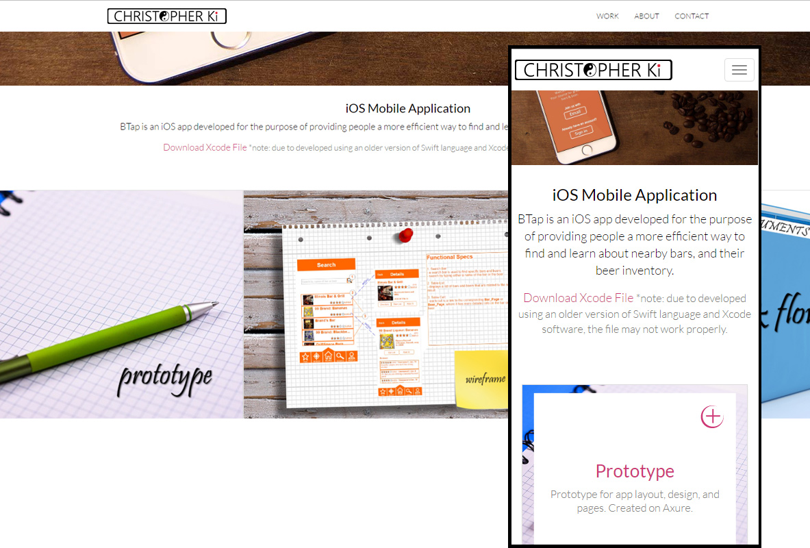
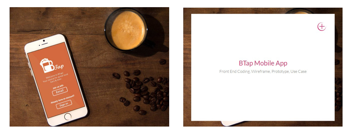
Old (top) vs New (bottom) BTap Page: Content layout is now from top to bottom design, making the order of the content clear. Images are now much larger than from the old website's for better experience.
| Roles | Tools |
|---|---|
| ⋅ Web Development & Design | ⋅ Software: Adobe Dreamweaver CS6 |
| ⋅ Brand & Icon Design | ⋅ Software: Adobe Photoshop CS6 |
| ⋅ HTML & CSS | ⋅ Software: Adobe Illustrator CS6 |
| ⋅ JavaScript | ⋅ jQuery API Documentation |
| ⋅ JavaScript & HTML DOM Documents |