| Contributions | Tools |
|---|---|
| ⋅ Competitive Analysis | ⋅ Axure RP |
| ⋅ Wireframes | ⋅ Pen & Paper |
| ⋅ Interactive Prototype | |
| ⋅ Feature Design | |
| ⋅ UX Audit & Documentation |
Floating Labels
competitive analysis ⋅ wireframe ⋅ prototype ⋅ user testing ⋅ UX Audit
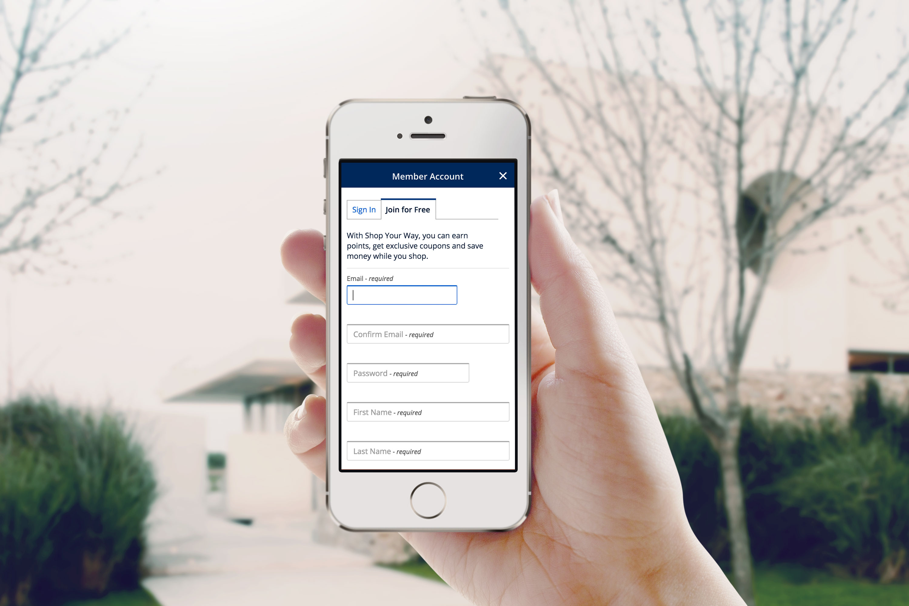
Project Summary
Project floating labels was a solution for improving the registration & sign in experience as well as every other page in Sears & Kmart websites that have forms to fill out. User feedback and data suggested that a portion of the users were experiencing frustration or difficulties in filling out the forms, and sometimes leave the site in the middle of checkout process.
Introducing a clear and a simple experience was vital to encourage our users to stay on the site and go through the checkout flow to the end.
Process
First step was to find a source and identify the issue, and data showed multiple problems users were having; some were not clear why they were getting an error message and can't go through the process, which means the error state or messaging was not clear or lacking. Some weren't sure what to type in the field, while others were having issues completing the phone number field.
To experience the issues firsthand, I went through registration & sign in page as well as all the other form pages that are spread across the Profile, Top of Funnel, and Bottom of Funnel. While scrubbing the website I've noticed a lot of inconsistency in patterns & conditions and also a lack of error handling or guides, which later on became another huge project of mine to bring consistency and a better user experience across the site.
Floating Labels
click to see details (interact by typing in the fields)
Possible reasons for not knowing what to enter includes labels and space; although each form field had its title above such as Email or First Name, it might not be clear enough for some due to form fields positioned close to each other with not enough vertical space in-between. That might've led to confusions if the title belongs to a field that's above or below. Each field had a hint text inside the field, but that meant users will not able to see them once they start entering in the field.
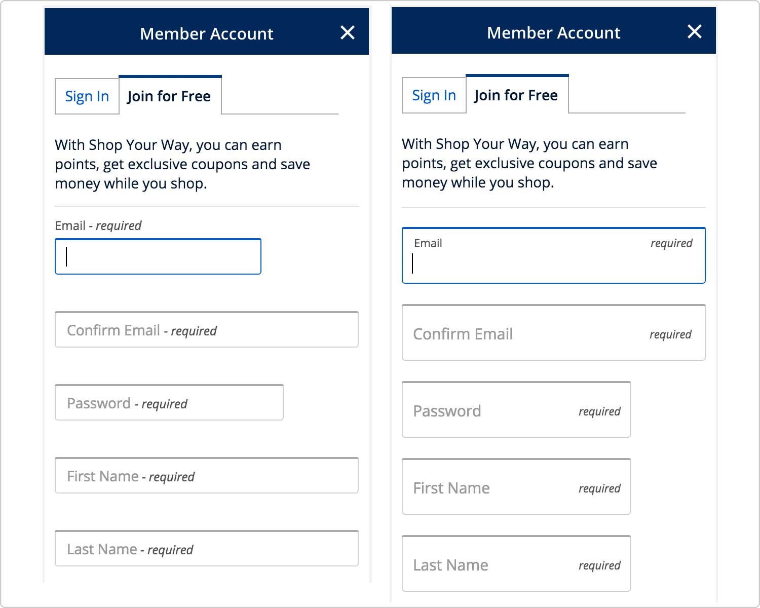
Solution was to have those labels more noticeable and available to the users at all times, which led us to designing the floating label pattern.
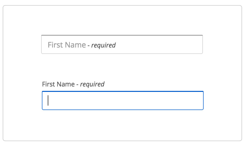
In default state, title can be seen inside the field along with a label detailing whether that field is required or optional. By placing the title within the field, it eliminates the confusion which field the title belongs to. It also saves vertical space, which is a plus on mobile that has a limited space.
onClick or onTap, the field goes into an active state where the title slides up above the field with animation. Dynamically changing the position of the title with animation catches the user's attention, allowing them to see and remember which field they are currently editing.
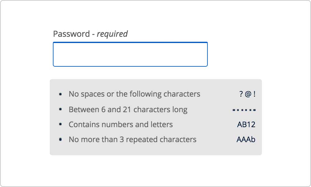
Hint is also an important element to provide when the field requires specific inputs from the users as that has a higher chance to causing errors. Password field is one such example where users are required to follow strict rules or conditions; to ensure a smooth password creation, I designed a conditional password hint that would dynamically appear whenever the password field is onFocus, and stay until the users move on to the next field. That allows users to check the required conditions for creating a password. Initial idea was also to add a checkmark or x icon in front of each password condition that would dynamically switch to one or the other upon meeting the conditions, but a discussion with developers revealed it wouldn't be an easy implementation and had to be omitted.
Error Handling
Lack of error handling was another cause that frustrated users. Majority of copy for error messaging were vague and didn't really tell the users how to fix it. They were also inconsistent across the site due to being handled by different individuals and teams over the years, meaning Address field from Profile and BOF potentially had a completely different messaging and sometimes even the validation rules. So I scrubbed and documented error messaging and validation rules for every form field in the site. My UX audit document included: name of the page, name of the field, validation rules, error messaging, conditions, UX recommendations, updated copy, and screen grabs of the issues. Once I finished documenting and sorting out the things that needed updates, I collaborated with a copywriter to rewrite several dozens of error messaging to clearly inform what you are missing, and how to fix.
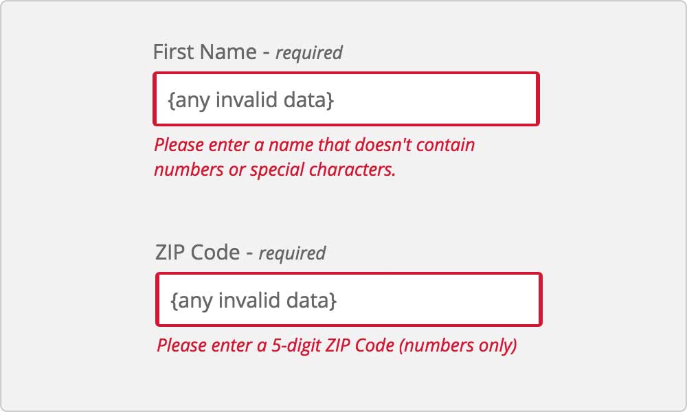
First Name field as an example, we are now specifying that the name cannot contain numbers or special characters instead of just vaguely stating as "invalid input". With new copy, users with hyphen or apostrophe in their names will understand right away that they will have to enter without special characters.
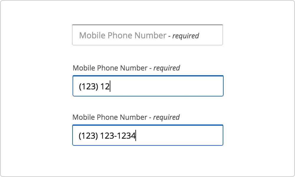
Dynamic Masking
Last step was to improve the Phone Number field. Previously the field had a static gray mask inside the text field formatted as (999) 999-9999 that would stay while the user was entering the phone number. Issue came from the mask misleading the users to think that they have to manually enter parenthesis and hyphen as well, when in fact those special characters or alpha values are not accepted inputs.
Solution was to remove a static mask and replace with a dynamic masking where the parentheses and hyphen will appear progressively as the user is entering numbers in the field. In addition, I collaborated with developers to add a new condition that only the numeric values to be registered and anything else will not be entered in the field. That removes the possibility of users entering invalid values in the field, leading to a significantly lower chance of getting an error.
A/B Testing
There were initially two different approaches to the floating label patterns: in-line and out-line. In-line was a pattern where a title and a hint would stay within the text field, whereas for the out-line they would move outside the field.
In-line pattern had a taller text field as it needs more vertical space for displaying a title, a hint, and a user input all within the field, and that raised a concern if having all those text nearby from each other would be distracting to the users. To see if one pattern performs better than the other, we collaborated with a UX researcher for an A/B test. Good news was that none of the users had troubles with either patterns, but also didn't have a strong preference over the other.
A following discussion post-test landed us on the out-line pattern; its design has more similarity to a previous pattern, which means returning users that are familiar with our site wouldn't be thrown off by a totally different design. And it also requires a less development time allowing a faster initial launch. Out-line pattern would also be better suited for mobiles as it takes less vertical space, allowing more content to be fitted in the screen.