| Contributions | Tools |
|---|---|
| ⋅ Use Case | ⋅ Axure RP |
| ⋅ System Flow | ⋅ Adobe Acrobat |
| ⋅ Wireframes | ⋅ Whiteboard & Markers |
| ⋅ Interactive Prototype |
Monthly Payment Plan
Use Case ⋅ System Flow ⋅ Wireframes ⋅ Interactive Prototype ⋅ User Testing
Project Summary
Monthly Payment Plan, MPP for short, was a highest priority project at the time; it was a project sponsored by Citibank with the goal of introducing a new monthly payment system, providing new options to our members. It was definitely one of the most complex and challenging projects as it had so many variables to consider, which will be explained below.
Process
My first step in tackling the MPP was understanding the current system; as Sears is a huge retailer that sells varieties of products ranging from appliances and electronics to gardening tools, jewels, and toothpastes, it naturally has multiple business units with each of them having different conditions and thresholds for providing offers. I collaborated with UXAs, stakeholders, BUs, and finance team to crack what all those conditions are in order to get started with creating the wires.
Wireframes
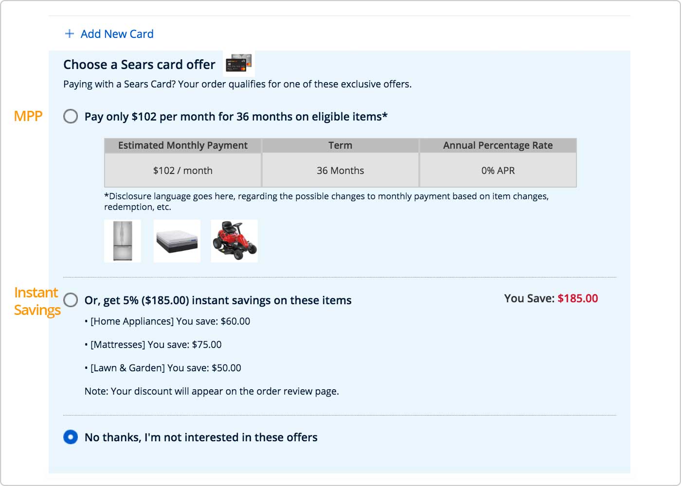
MPP came with multiple tiers that vary in duration and an annual percentage rate (APR), each having different price thresholds for the purchase to be qualified for the offer. On top of that, items from different BUs had their own unique rules as well, making it even more complex. And that resulted in a lot of misunderstanding and miscommunication between all the BUs and finance team. To ensure that everyone is on the same page, I created the wires that demonstrate around 10 major scenarios that explains what we do in scenario X: e.g. Two items from different BU in cart, one meets the threshold while the other doesn't; does MPP offer apply at the item level or cart level? Three items in cart, two eligible for MPP while one eligible for Deferred; which offer do we provide to the user?
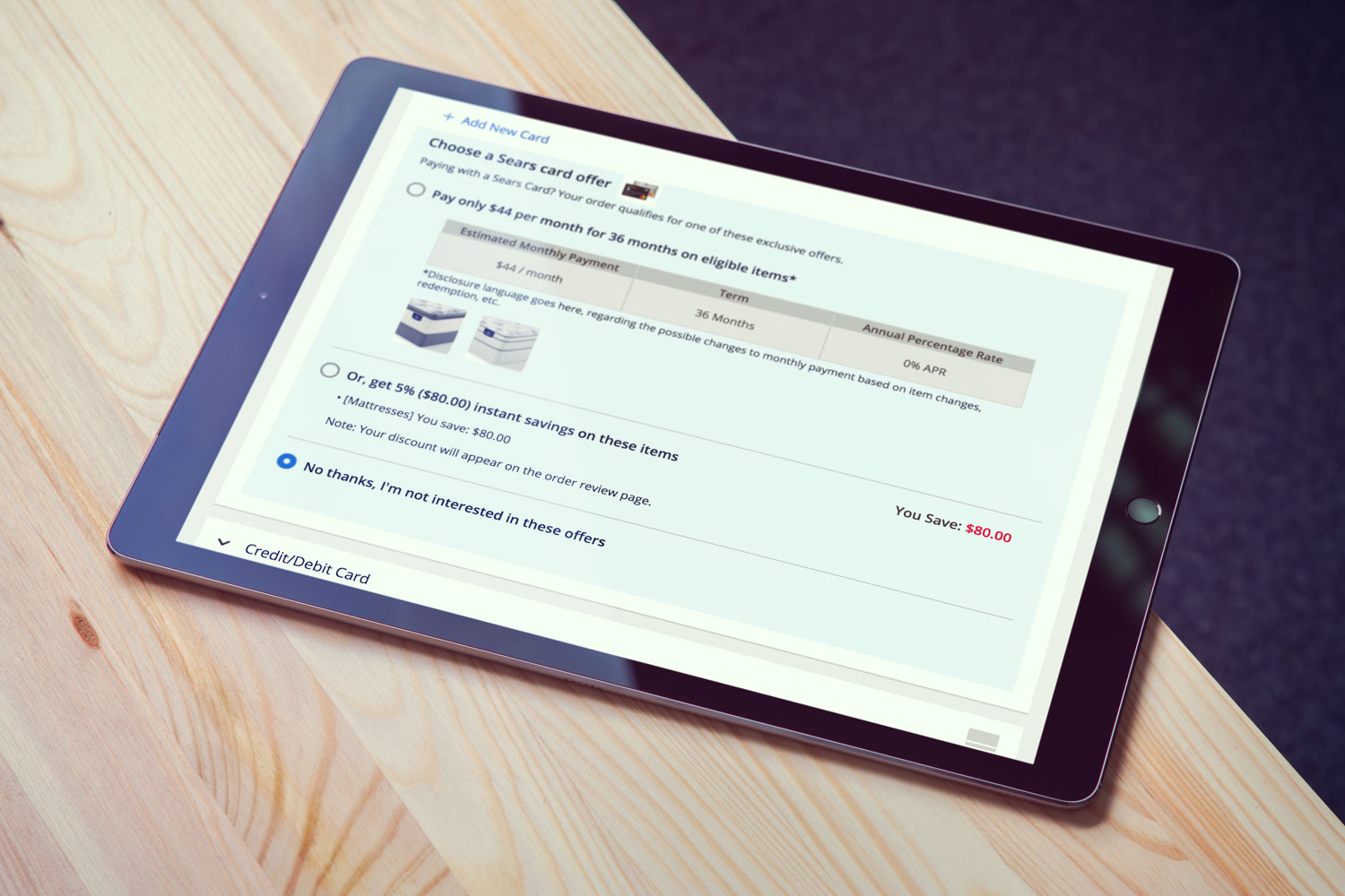
Above is a Sears card offer section from the Payment page where the MPP resides. As Payment is a huge page with a lot of content such as points, payment methods, and billing address, I added a light blue background for a better noticeability, with blue being chosen as it's one of our brand color. Three most important information, which were estimated monthly payment, duration and APR, are displayed in a table format to make them stand out the most.
Product image is shown as a visual indicator of MPP eligible items, and is placed below the table for the best reading comprehension. Having a product title made the offer section too congested, which is why we have decided go with product image only.
Having a bit of information redundancy in a radio button title and a table content was not by a choice, but legal reasons that involves clarifying information. Working on this project got me to learn there are legal rules that need to be followed and doing so sometimes meant sacrificing the design or the flow of the products.
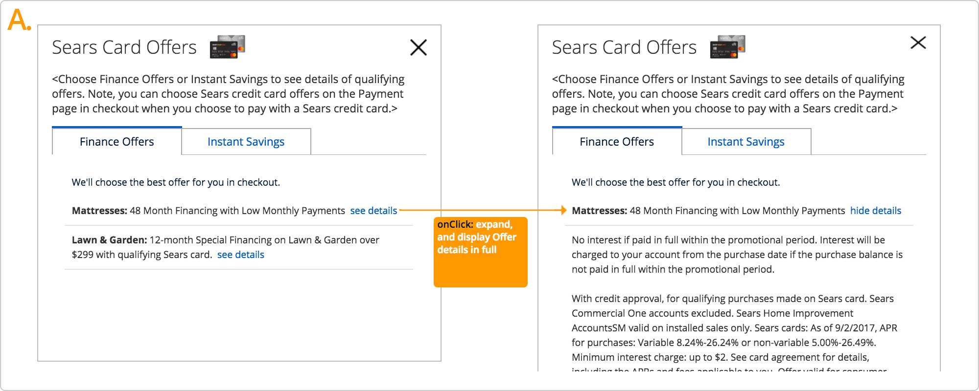
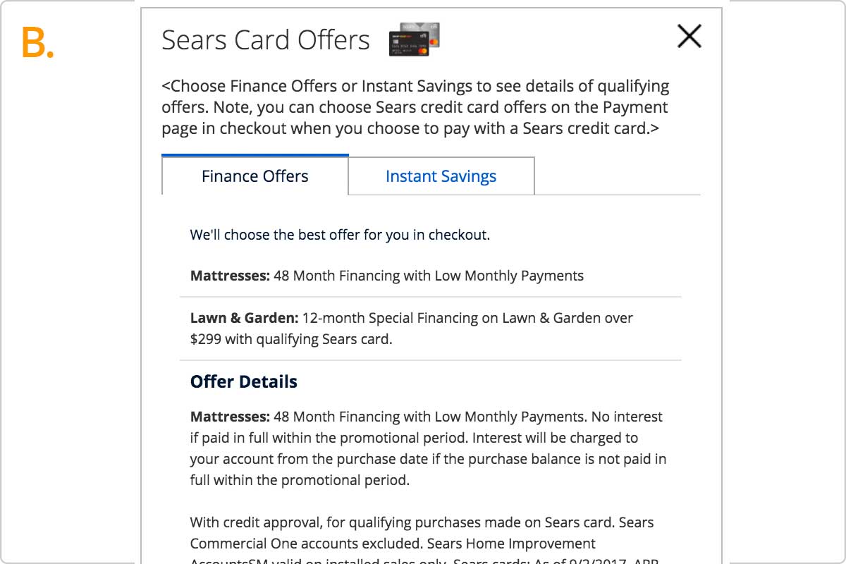
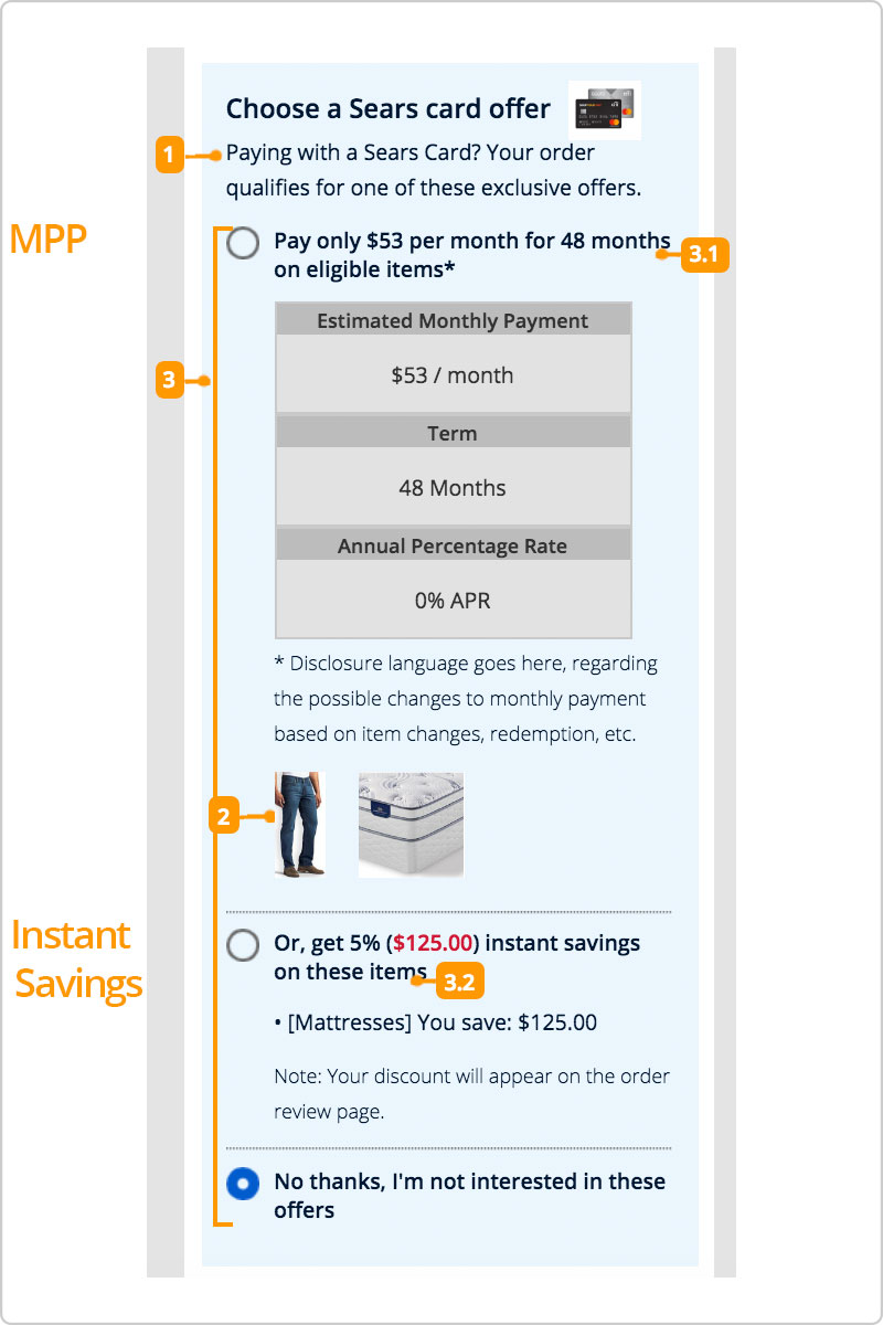
Above is another such example; it's an MPP layer which displays eligible offers and details. Ideally, a preferred design would be an A that initially displays only the core information the users would be looking for, and clicking a link "see details" would expand and display the rest of the offer details. This approach eliminates a lot of noise from the layer, making it easier for users to digest the information instead of being overwhelmed by a wall of text.
But there is a one-click away rule that must be followed, which is required to disclose all the details of the offer or ad single click away from the page that the offer was first mentioned in. B was a solution to the one-click away rule; I placed core information at the top with a line break below, and then put all the details at the bottom as that would allow users to read what really matters first without getting lost in text.
Prototype for UX Testing
click to see details (click Redeem Points button to see the offer section changing)
Another factor that made the MPP project even more complex was points & coupons. As applying points or coupons would lower the order total, it could potentially drop the price below the minimum threshold, which would make the cart no longer be eligible for the MPP offer, and must be switched to other offers such as Deferred, or none.
My approach was to dynamically change the offer display upon applying the points if that resulted in lowering the price below the threshold. Main concerns were if the users would notice the change and understand the reasoning behind it. Comprehension on the MPP offers itself was another concern.
So we collaborated with UX researchers for user testing; we sat down in a room and planned out a test scenario, and pages and features the prototype will be needing. I built an interactive prototype once we fleshed out the plans, which was then used for the user test. Results indicated some were having difficulty noticing the change or understanding a reason, which led us to add a disclaimer copy as well as a notification message at the top of the page.
Challenges & What I Learned
MPP remains as one of my most memorable projects as it was my first one to collaborate with a third-party company, Citibank in this case, in such a huge scale; Throughout the duration of the project I got to present and walk through wires to stakeholders, finance team, BUs, and representatives of Citi dozens of times. And each meeting often came with new requirements and changes resulting in iterating the wires and presenting them again. There were sometimes conflicted views or requests from different parties, and it was a role of us UXs to recommend solutions which involved collaborating with many different teams of designers, researchers, developers, and stakeholders.
The whole project was a very valuable experience with many things learned in the process; as a result of working on the financial offers, I became well versed in how deals, points, and offer systems are structured and operate. Designing the Payment page, Cart, and other bottom of flow pages got me to be familiar with the whole checkout flow, as well as having insights on the back-end information such as during which part of the flow does data X become available. Experience I gained from this project helped me improve as a UXA.