| Contributions | Tools |
|---|---|
| ⋅ Use Case | ⋅ Axure RP |
| ⋅ System Flow | ⋅ Pen & Paper |
| ⋅ Feature Design | ⋅ Whiteboard & Markers |
| ⋅ Wireframes | ⋅ InVision |
| ⋅ Interactive Prototype |
Single Page Checkout
use case ⋅ competitive analysis ⋅ system flow ⋅ wireframe ⋅ interactive prototype ⋅ user testing
Project Summary, Scope & Deliverables
Single Page Checkout was a highest priority project in 2018 with the goal of overhauling the checkout experience for Sears & Kmart across all platforms: desktop, mobile and app.
Scope of the project was to make a transition from a multi-page checkout into a single-page checkout to achieve a simpler and a smoother checkout experience for our users. And that involved reinventing everything in checkout such as flows, interactions, design & layout, and conditions to support every variable and scenario that can happen in the purchase flow.
As a UXA of this project, responsibilities and deliverables include competitive analysis, system flow, conditional wires, fully interactive prototypes & user testing, and debugging the issues from the live sites through a collaboration with the developers.
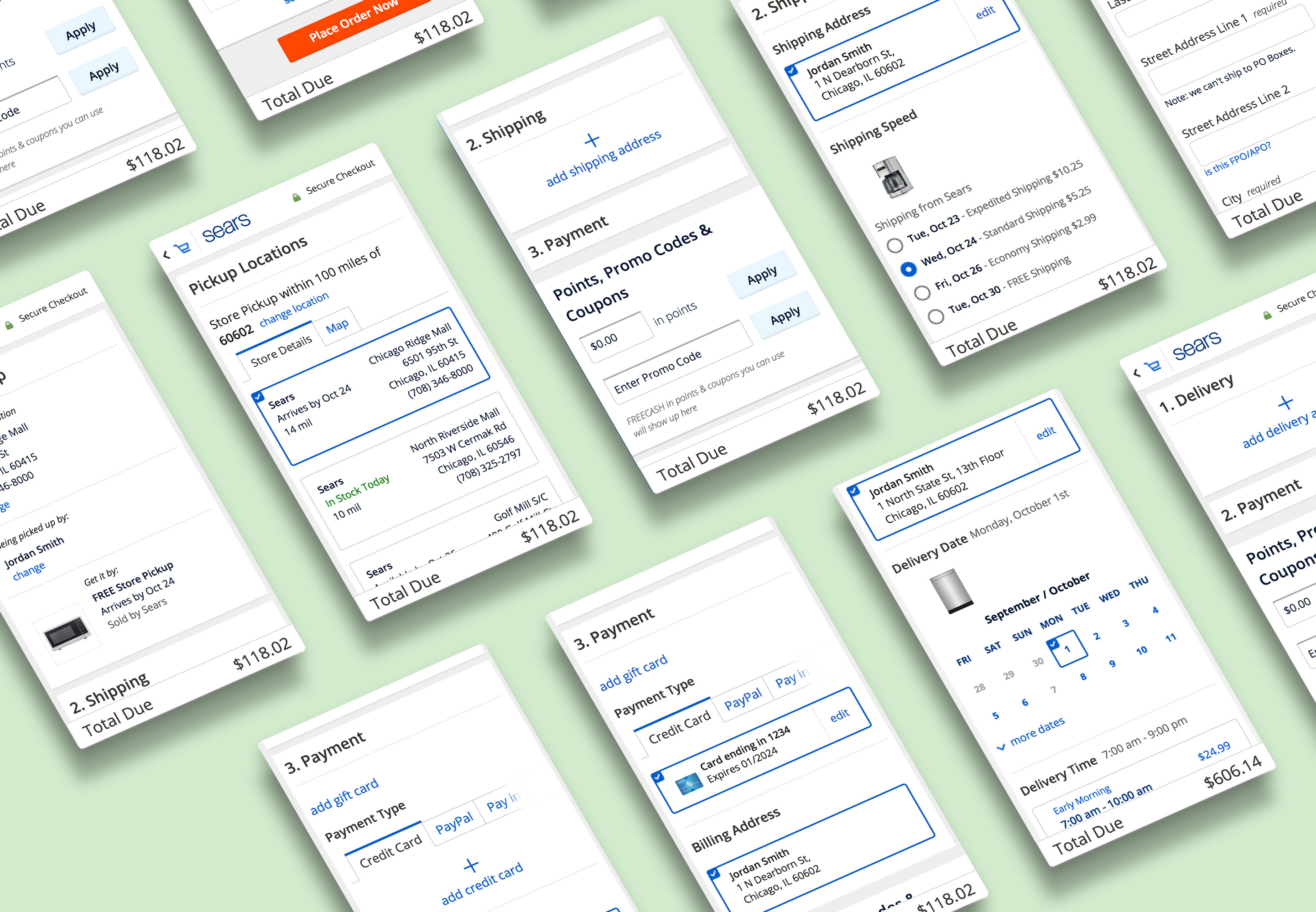
Competitive Analysis
First step was to perform a competitive analysis to study and document every detail of the checkout experience that other e-commerce retailers were using, such as:
⋅ Format: multi-page or singple-page?
⋅ Flow: transition between sections such as Shipping and Payment. Order of completion?
⋅ Layout: fully inline or a mix? Popup or accordion? Structure of the components.
⋅ Experience: able to edit information anytime and not lose progress? Error handling?
⋅ Information: which and how much information are shown? Are they cluttered or clear.
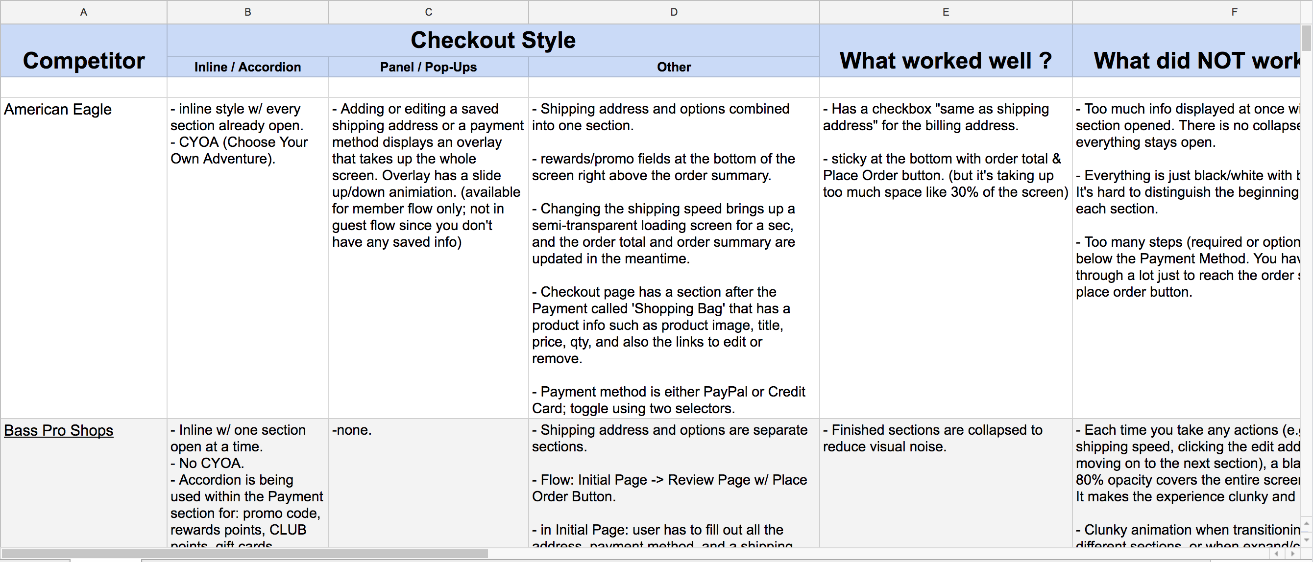
Analysis was done for both desktop and mobile, and its study results were used as a guide deciding on our approach.
System Flow & Wireframes
We started out with a low-fidelity flow, going through theoretical and practical flows for the new checkout experience in our brainstorming sessions among the UXAs.
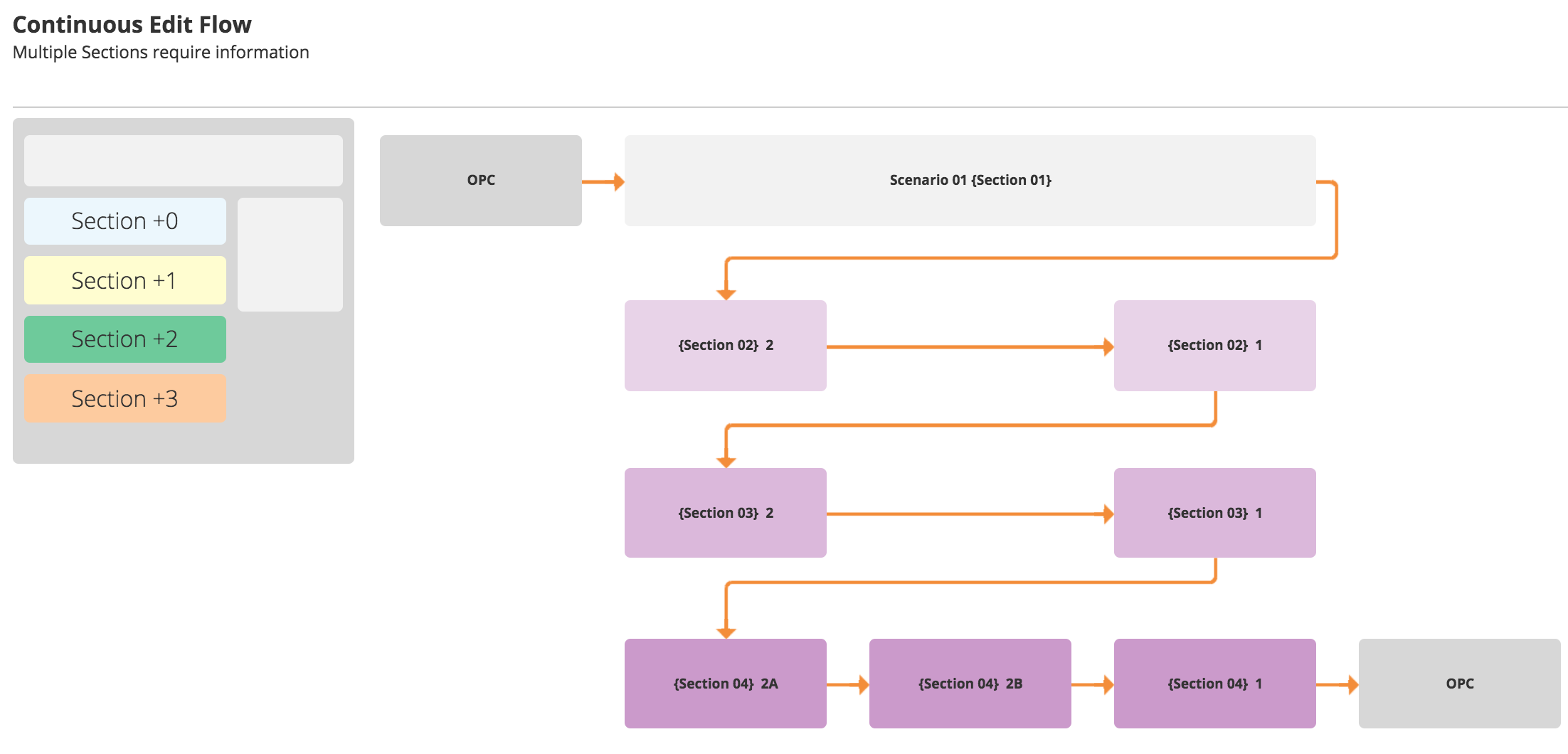
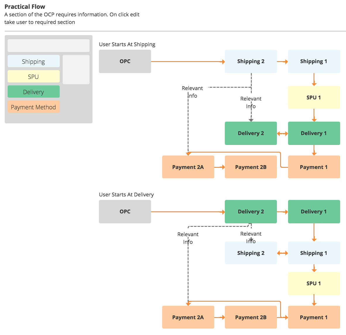
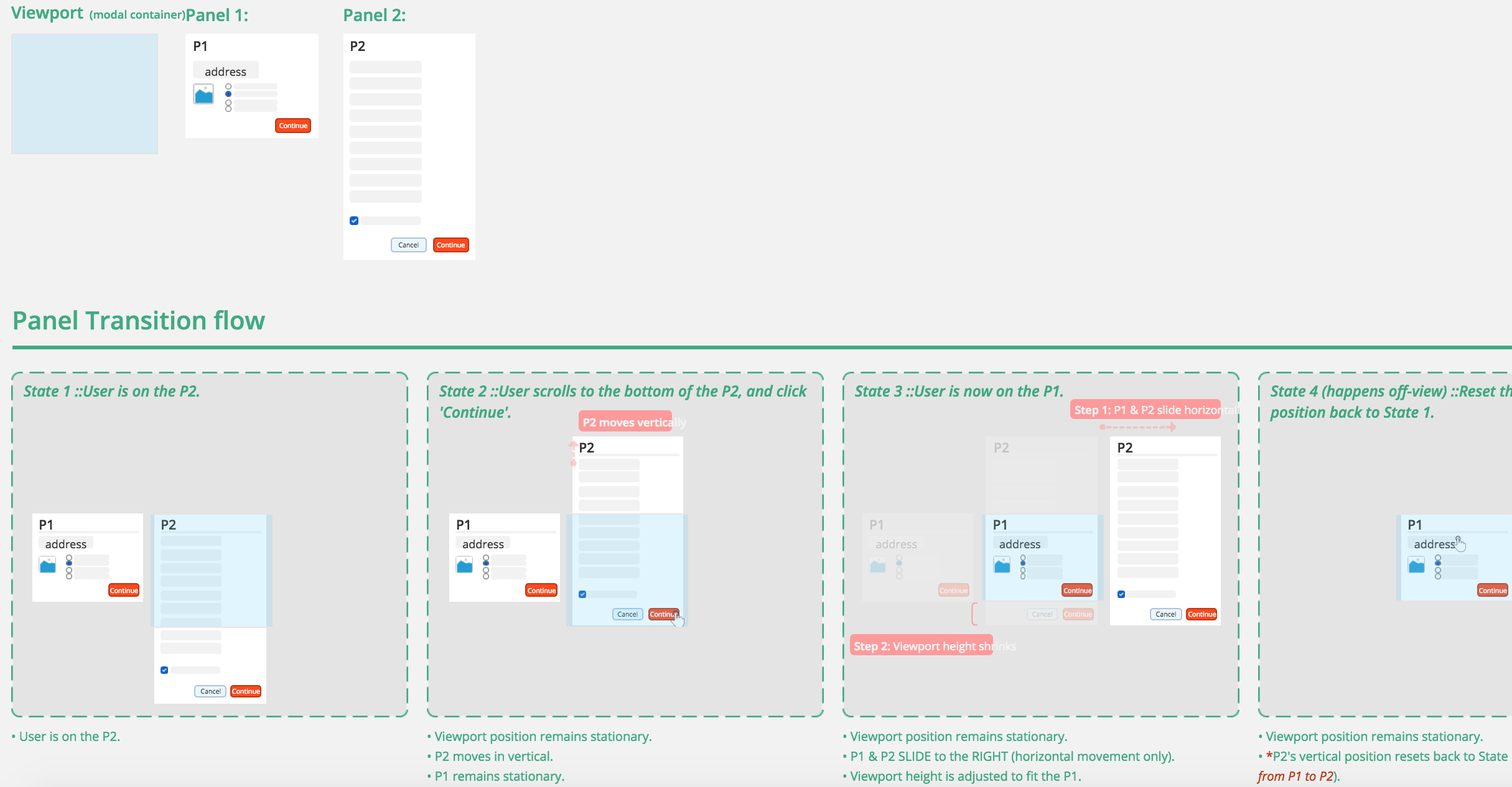
Mid and high-fidelity flows were created later down the road once we flshed out the conditional wires. Video below is an example of looping, animated transition that I created in Axure in order to visually demonstrate to the developers what the interactions and content transition should look like.
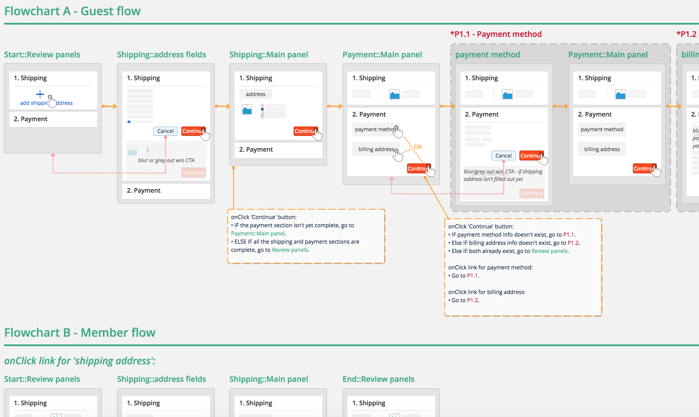
Orders of actions and the conditions of every transition between modules and panels were also documented in the wires for the ease of implement.
High-fidelity flows were created when we were exploring three different approaches to the single page checkout experience, and comparing the usability, numers of steps required, and flows of each version.
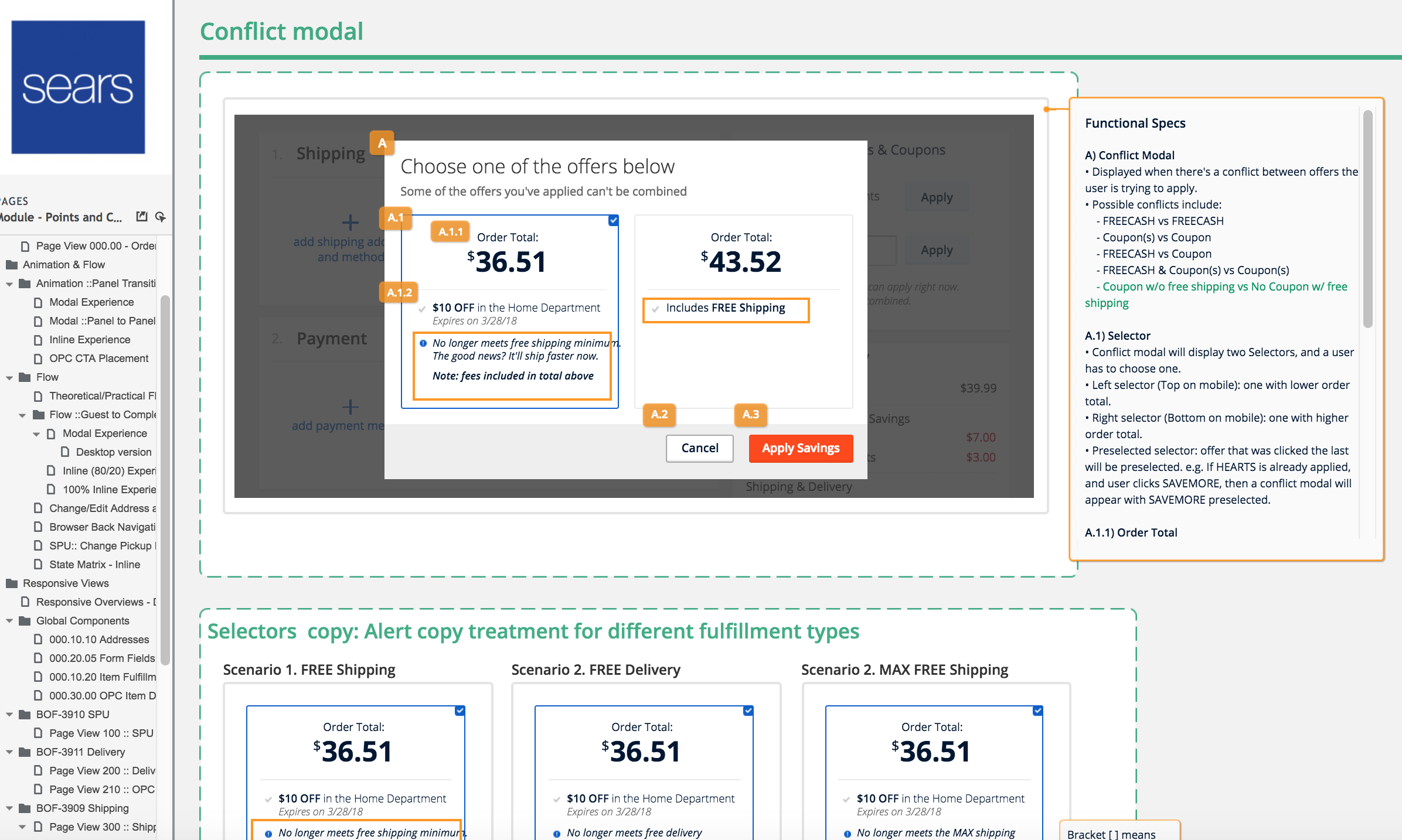
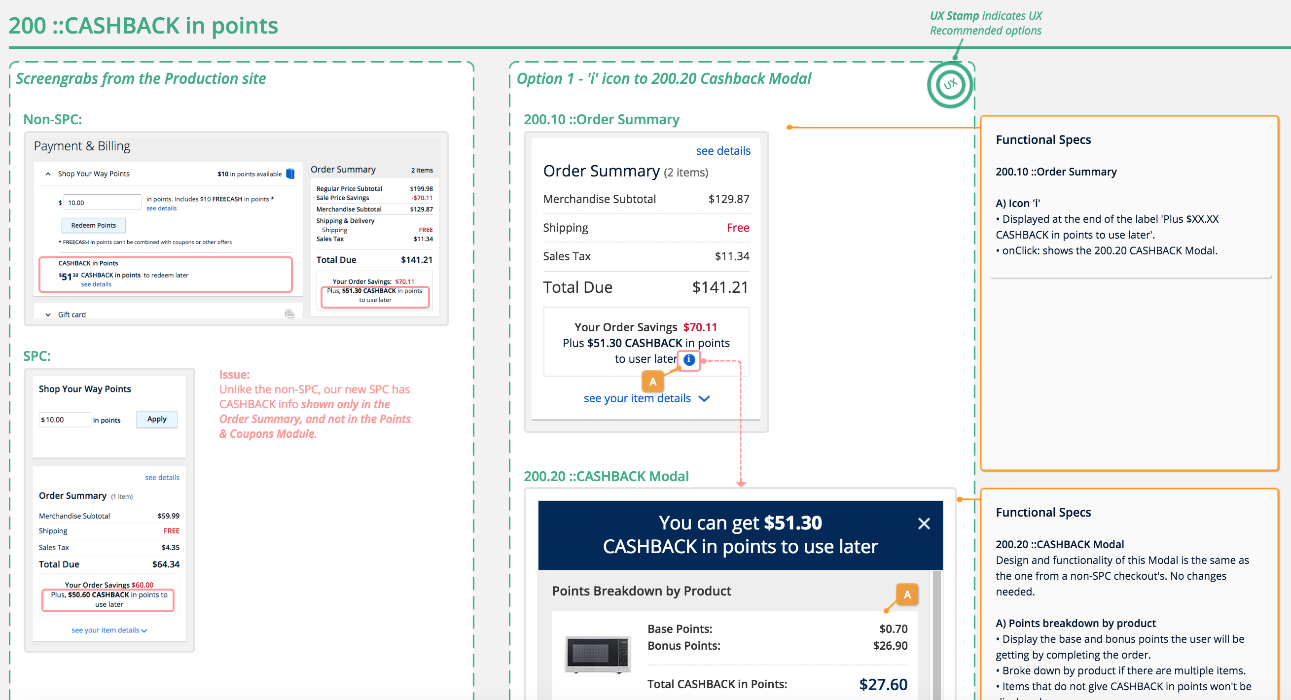
Conditional wires with functional specs were delivered as well, which have gone through numbers of iterations as we've explored variations of options as well as making further improvements and changes based on the user feedbacks gotten from the user testings.
Interactive Prototypes
click to see the prototype
Once the wires and flows were approved by the stakeholders, next step was to build fully interactive prototypes for the user testing. As we were conducting 'choose your own adventure' type of testing where we let the users interact and go through the checkout flow as they would like without any forced instructions/guidance, it was essential for me to build fully interactive prototypes that can support and run every possible scenarios that can happen based on the users' actions.
Prototypes were built for both desktop and mobile in three variations as we were exploring three vastly different approaches for the new checkout experience. Each variation's gone through numbers of iterations.
Challenges
Main challenge was to come up with the layout & flow that would provide users the simplest and the smoothest checkout experience without the issues that users commonly face when going through checkout in many other sites, which are losing progress, forced to go through steps that were already done and refilling the information.
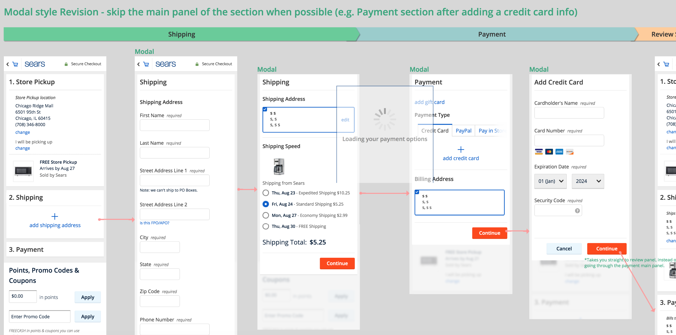
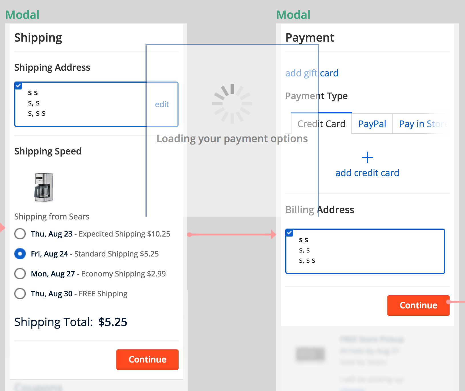
It came down to two different styles: Panel vs Full Inline. Panel is a brand new approach that we came up with where all the panels that require user inputs and data such as shipping address panel and credit card input panel are shown in a modal, having users focus soley on completing the current step and thus removing the possibility of the users jumping over to a different section halfway through.
In addition to that we have come up with a continuous editing flow where we will take users through all the steps that are not yet complete before landing them to a review mode where users can review and edit any section they want. Main thing we had to make sure for the continuous editing flow was to have it clear which section users are currently at, such as Shipping, Delivery, Store Pickup, and Payment section. Incorporating animated transition hleped achieving it where the panel within a modal would slide left or right based on the hierarchy between the panels. A loader screen with a label would also be shown when transitioning between sections that will say you are being taken to the Payment section and such.
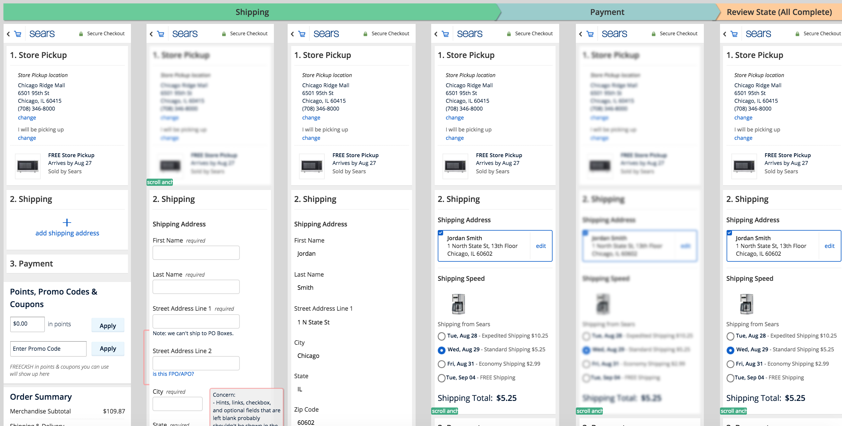
Full Inline was another approach which is closer to what many other competitors are doing where each section such as Shipping and Payment is like an accordion that expand and collapse when editing or entering information. A huge downside of a traditional Inline style that is commonly used in many other websites is that every section is accessible at any time, and thus have a high chance of users jumping over section to section halfthrough losing progress and being forced to refill the information. Another common issue is that when users go back to a previous step to make an edit, they are likely to have to go through all the other steps once again that are inbetween. So a traditional Inline actually has similar issues as multi-page checkout.
Our solution to remove all those issues that came with a traditional inline was to have users focus soley on the current section that they are at, and that was achieved by dynamically blurring out other sections similar to how the modal has a curtain in the background that makes everything behind it darker or blurred.
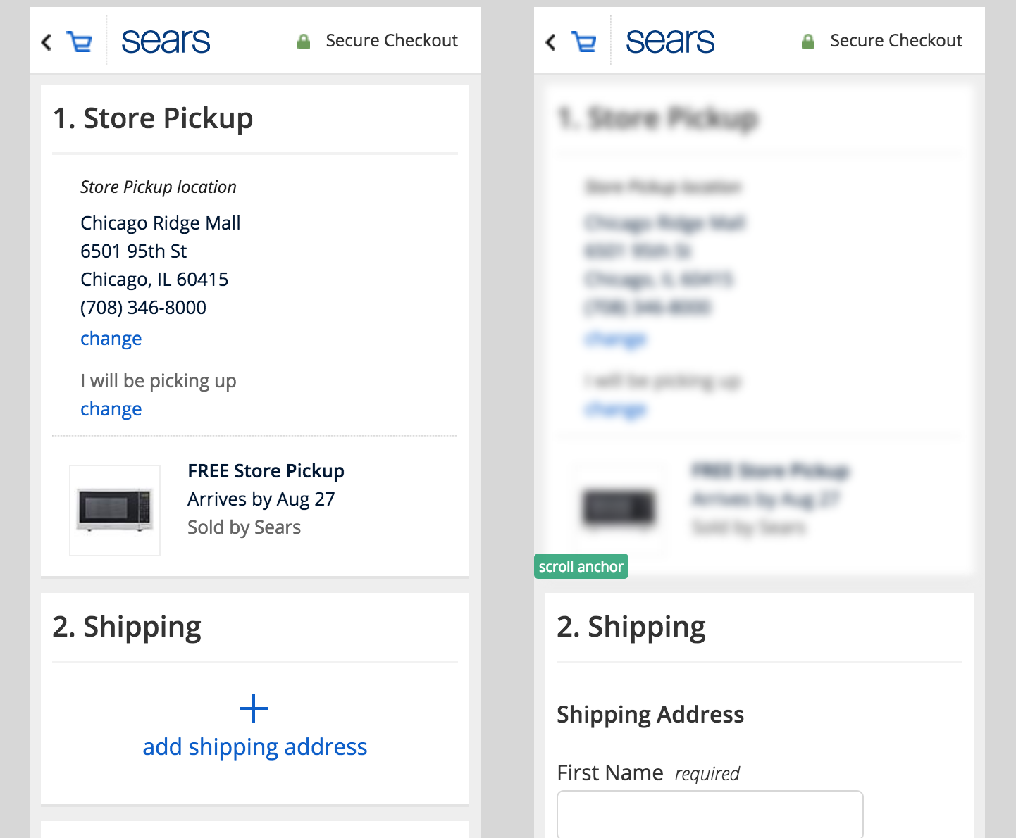
By blurring out the other sections, we are removing all the distractions and allow users to focus on the current step. We've aslo assigned anchor points on mobile, directing the vertical position the screen should scroll to when transitioning between sections so the users can stay on track and progress to the next step without getting lost.