| Contributions | Tools |
|---|---|
| ⋅ Use Case | ⋅ Axure RP |
| ⋅ System Flow | ⋅ Pen & Paper |
| ⋅ Feature Design | ⋅ Whiteboard & Markers |
| ⋅ Wireframes | ⋅ Adobe Photoshop |
| ⋅ Interactive Prototype |
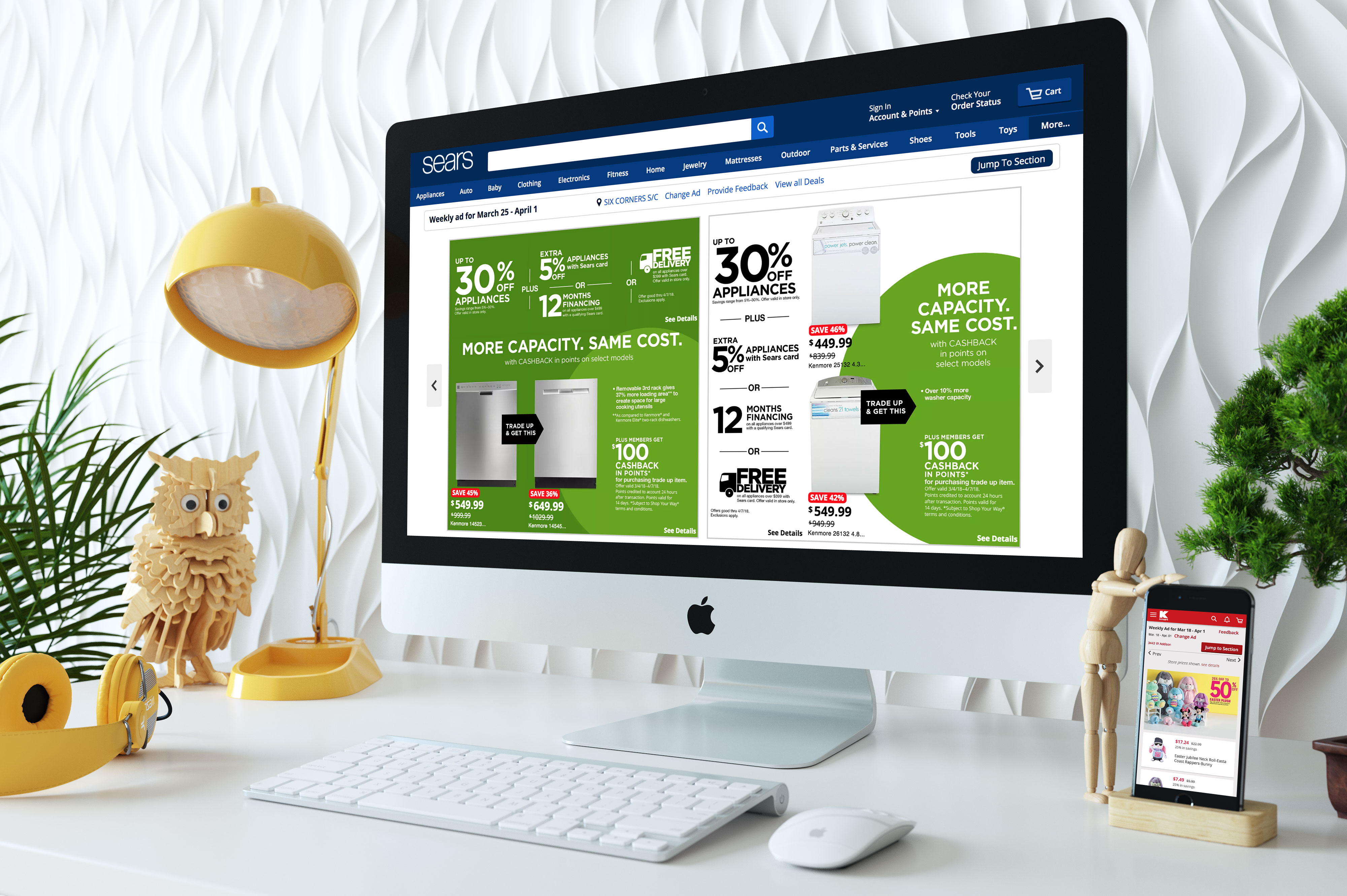
Sears & Kmart Weekly Ad
use case ⋅ competitive analysis ⋅ system flow ⋅ wireframe ⋅ interactive prototype
Project Summary
Weekly Ad, a digital deals listing page featuring a local, store specific deals and products to our members. As Sears is a giant retailer with both online and hundreds of local stores spread across the United States, the main goal was to solve how we would present products and pricing that are specific to the local store of the users, and avoid confusions that might happen when they see a possible price difference between online & local, or from one local to the other.
Process
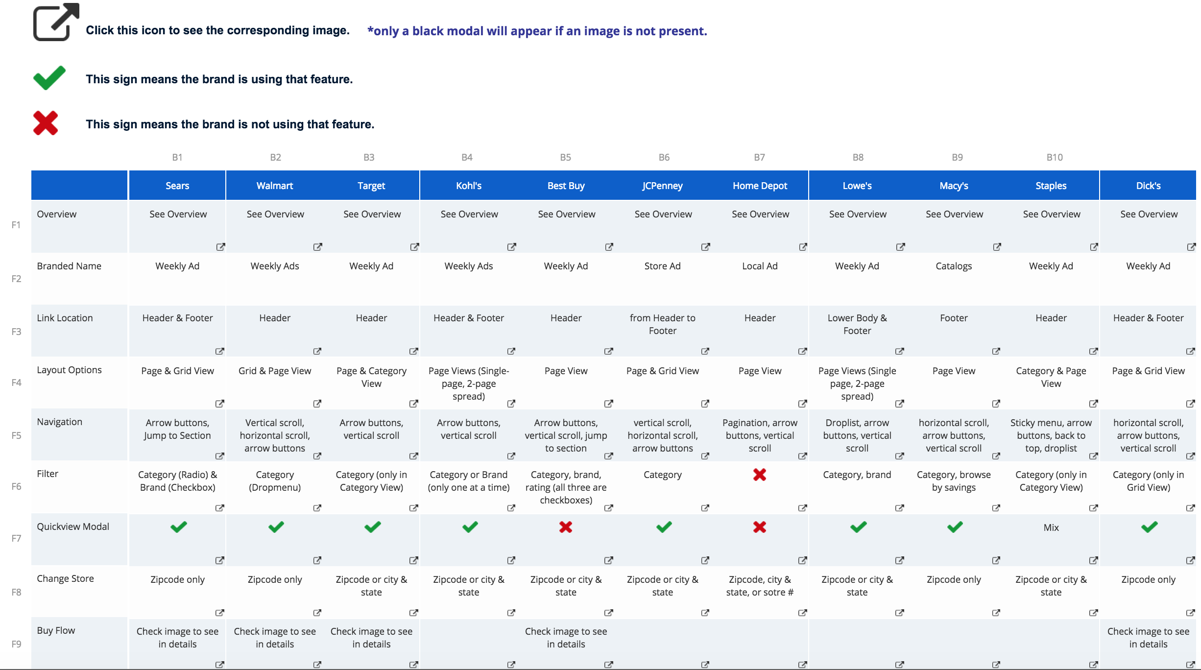
As a first step, we UXAs collaborated with a product manager and created use cases for covering all the possible scenarios of what users will want, expect, and do upon browsing the Weekly Ad, and what our system will need and provide. After sorting out the requirements, I performed a competitive analysis using a template that I built in Axure that makes use of Repeater to remove repetitive actions, allowing a faster workflow when documenting a research or analysis.
Analysis subjects ranged from core features such as navigations, layout, ad template, modal, to smaller details such as pricing, description, and character limit.
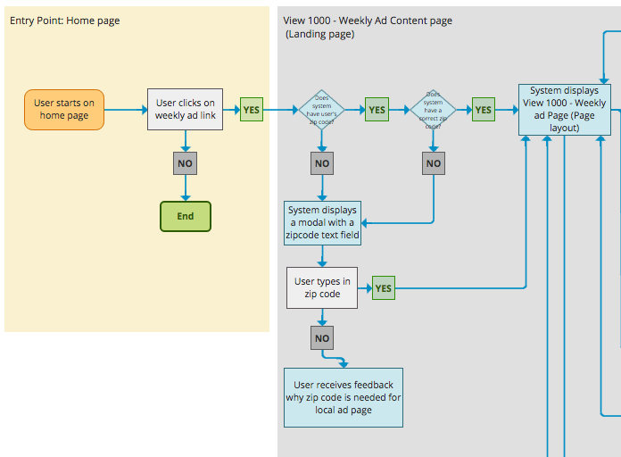
System Flow
click to see details
As this project was a complete overhaul of the previous Weekly Ad, it was essential to build out the flow as well. I started out by creating a system flow that could be used as a starting point for further discussion and polish; we UXAs went through iterations of whiteboarding sessions to flesh out the flow, and shared with stakeholders along with wireframes.
Wireframes & Problem Solving
click to see details
Competitive analysis and system flow gave us insights on what components we would need. I created wireframes for all three platforms: desktop, mobile & app. For the sake of time efficiency, desktop wires were created first, and then came the mobile & app wires once we got the initial approval from the stakeholders. Conditions and functional specs for every Weekly Ad component were documented in the wires, which were then shared with stakeholders and developers.
Problem solving was a very engaging and fun experience. I would create several versions of approach for designs and functionalities and check in with my manager, which then he would go through and give feedback; if something I suggested wasn't feasible then he would explain why. Same with the developers, I'd have a meeting with them to see if my UX recommendation was possible to implement.
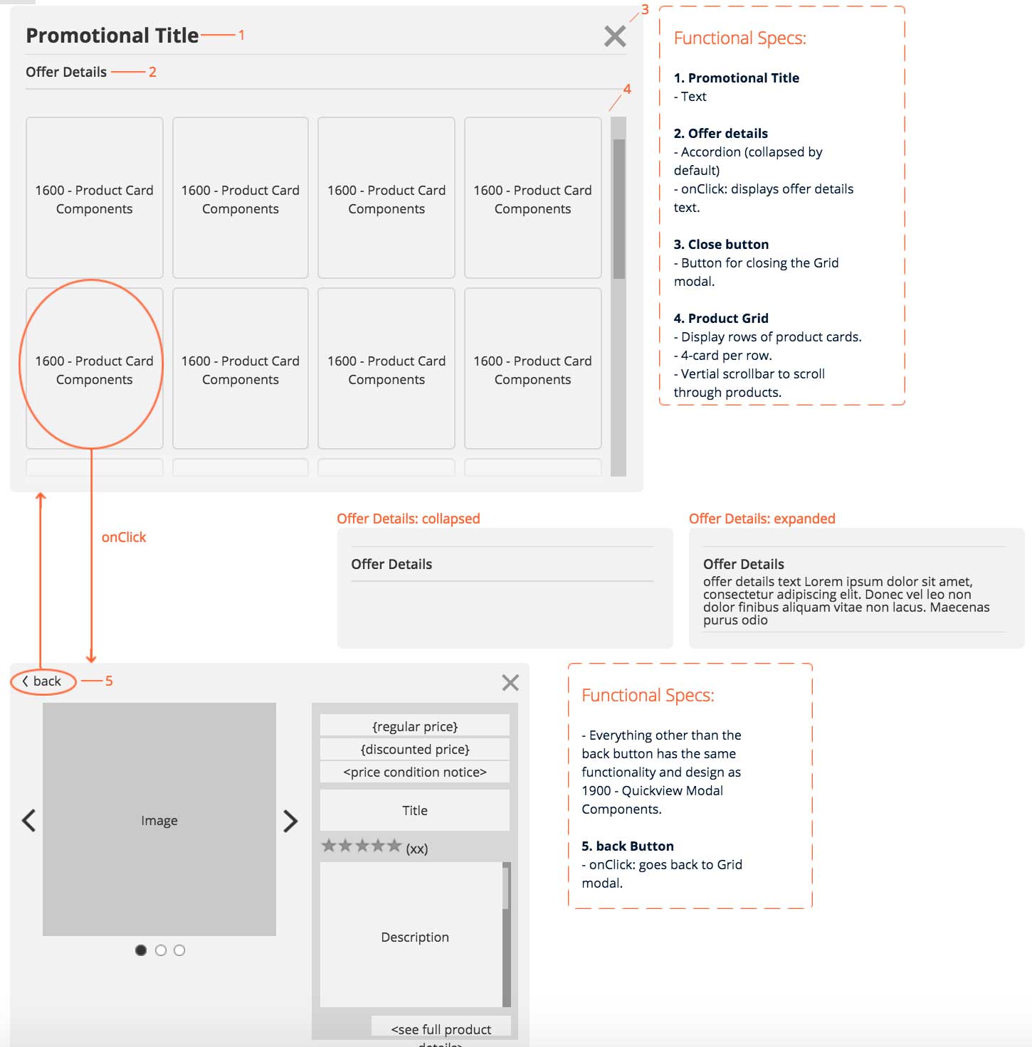
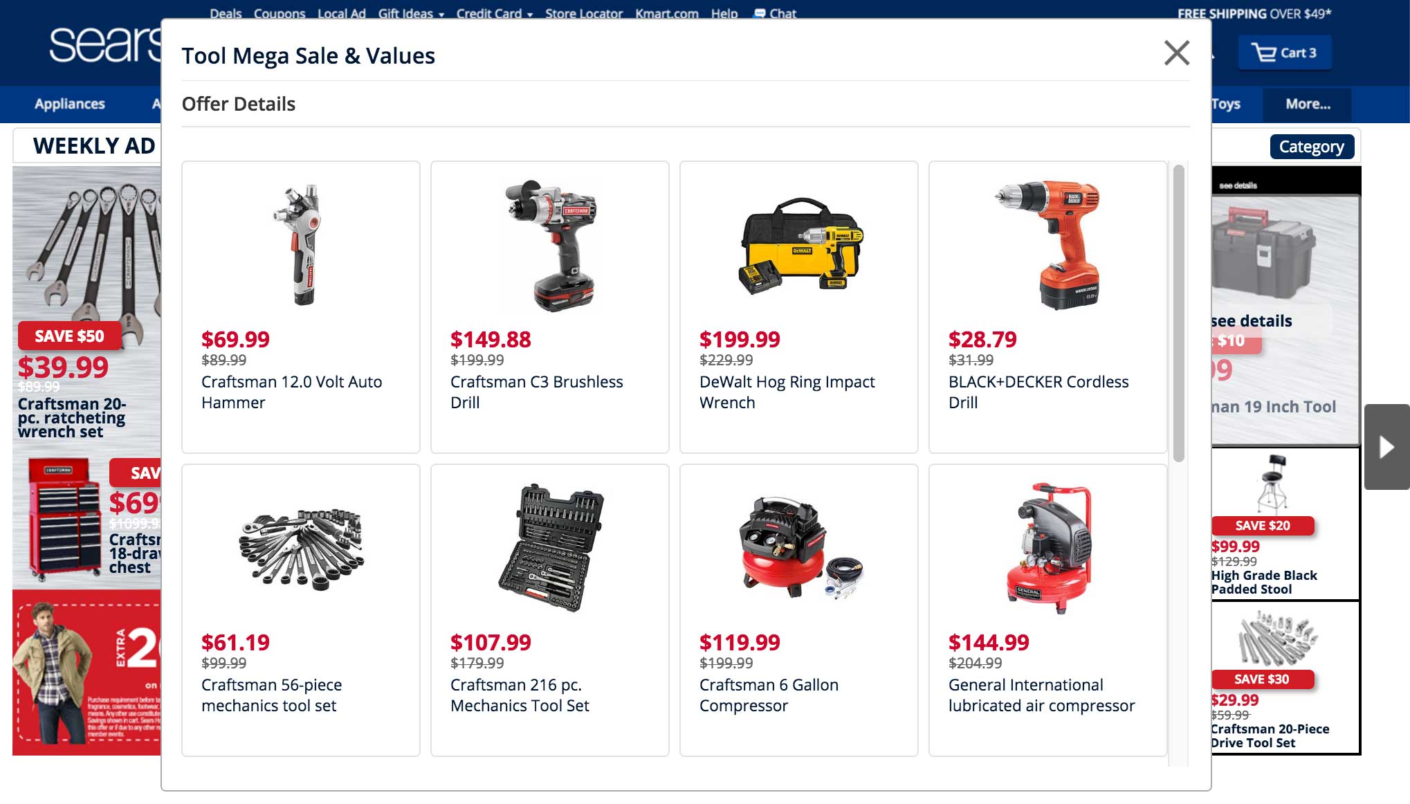
Above is a Quickview Grid Modal, a component that allows users to see a list of products and their details without having to navigate to a different page. Weekly Ad is an interactive circular ad with products and promo displayed. Clicking an individual product image would show you the details of that specific product, whereas a promo would show you the details of multiple items that are part of the promo. Quickview Grid Modal was our take on how to present the promo and its products to the users; onClick promo, it'd launch a Modal with a title and offer details that's expandable but collapsed by default in order to reduce visual noise. Below the offer details is a grid that displays all the items that's part of the promo. And each product card contains product image, title, regular price, and discounted price. List also has a vertical scrollbar in case there are more items to be shown; scrollbar also helps keeping the height of the modal within the maximum limit set by our enterprise pattern rules. Clicking a product card would slide in the next panel of the Modal which contains a detailed information of the product such as product image, title, price, description, a label notifying a possible price difference between online and in-store, and a button that will add an item and send users directly to Cart page.
The purpose of the said Modal was to provide all the core product information within the Weekly Ad page, and thus removing the need to navigate through different pages during the buy flow. That would help cut down a few steps in buy flow, as well as reducing a risk of users getting distracted and abandoning their Cart. But this Grid Modal was ultimately put on hold from release due to a several factors such as time and resource. Buy flow was changed as well so it would send users to product details or listing page first rather than going directly to Cart due to business decisions.
Interactive Prototype
click to see details
After wires and flows were approved by the stakeholders, next step was to build a pixel-perfect interactive prototype demonstrating all the features and navigational flows of the Weekly Ad. Prototype that I built in Axure was then used in user testing, as well as being presented to our leaderships.
Challenges & What I Learned
Challenges often came from how massive Sears is, and how complicated their operations are as a result. While performing a competitive analysis, I noticed that majority of competitors didn't have to deal with price or product differences between local vs online or local vs local. That allowed them to use simple static ad circulars that are purely made of images featuring product images and pricing, and use them for every store. But that method wouldn't work with ours, as we have to display dynamic pricing, and possibly show different versions for hundreds of stores.
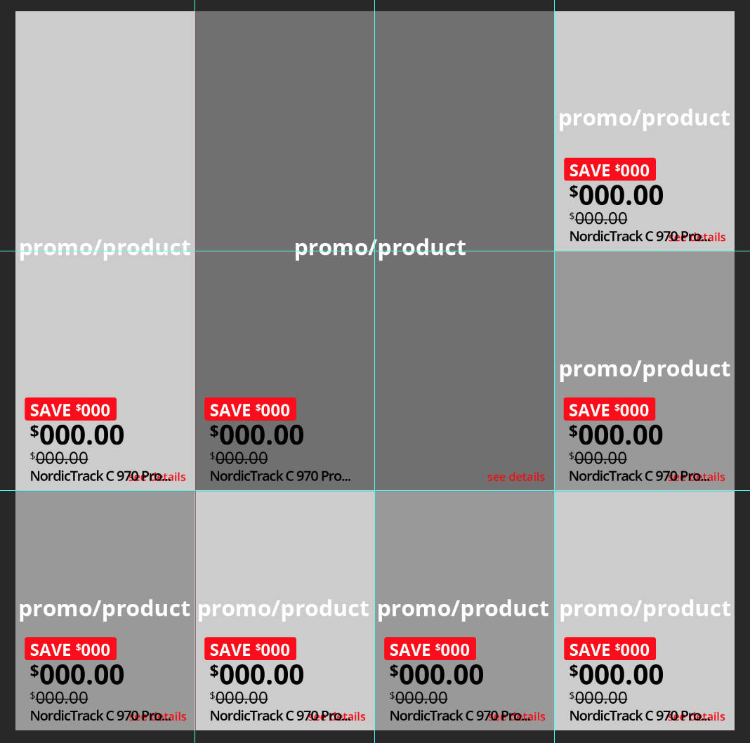
To ensure all the ad circulars will have consistent looks and patterns, and support dynamic pricing, I created roughly 100 templates in Photoshop that has guidelines for component placements and sizes. The templates were then imported into our management tool and used by the designers to create the circulars.
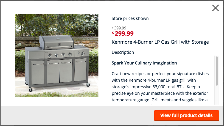
One of our biggest concerns was ensuring that our shoppers and members won't be confused when they see a possible change in price once navigating from Weekly Ad to product details page. To do so, we added a quickview modal that will pop up onClick product image. Inside the modal is a product image, pricing, description, and a label right above the pricing that clearly states that the price that you see is a store price, not an online. By introducing a quickview modal in-between the flow, user is given an opportunity to check the details of the product as well as be notified of the possible price difference. Label was added below the ad circulars as well along with a see details link which would display a layer explaining the reasoning in details.
The layout and features seen in our final product was in fact not our initial approach. After we went through all the process of flows, wires & prototype, UX research, and being approved by the stakeholders, we presented to our leaderships but was turned down because they wanted to explore a different style. As a result, we restarted from scratch and went through the previous process the second time. We collaborated with UX researchers to perform an A/B test to see which version was preferred by the users. Users' preferences were almost 50/50, and we've landed on the latter version as our final product.