| Contributions | Tools |
|---|---|
| ⋅ Widget Creation | ⋅ Axure RP |
| ⋅ Interactive Prototype | ⋅ Pen & Paper |
| ⋅ User Testing | ⋅ Whiteboard & Markers |
| ⋅ Wireframes | ⋅ Adobe Illustrator |
| ⋅ Pattern Design | ⋅ Trello |
Enterprise Widget Library
widget creation ⋅ pattern design ⋅ user testing ⋅ wires & prototype
Project Summary
The enterprise widget library was built to be used by Sears and Kmart UXAs to efficiently create wires, and build prototypes for UXR and deliver consistent deliverables across stakeholder audiences.
Using the widget library allows us to quickly create wires or prototype by simply drag & dropping desired components from the library into canvas, reducing the time it takes to build.
Process
This project was started out when I volunteered to update an enterprise library that hasn't been updated for years. Since then it became an educational side project for me to collaborate with two other UXAs, one acting as our supervisor. We first planned out a roadmap for how to tackle the project, which was divided into three buckets: 1. Update and creation of widget library components for both mobile and desktop 2. Organization 3. Sharing & Maintenance.
1. Update & Creation of Widget Library
click to see details
First in the list was to update the widget library. As it hasn't been updated for several years with outdated patterns and missing components, we determined it would be the best to create a whole new library that would match with our current design patterns.
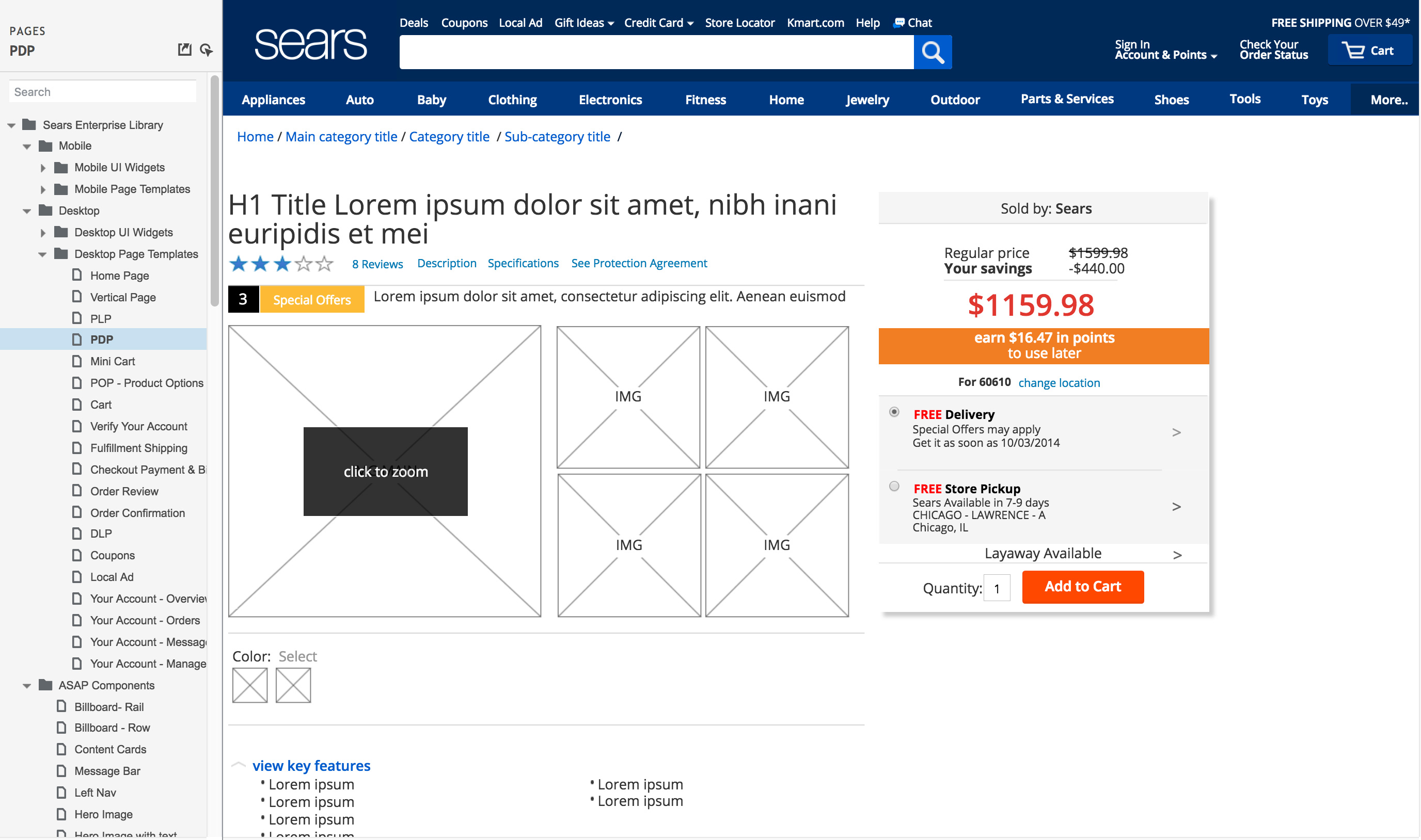
My first suggestion was to decide on the dimensions for both desktop and mobile as it is important to have all the pages and the components inside to be consistent in size. It was our general practice to design products that would fit even on a smaller screen, which was a huge factor in our decision making.
Next was deciding on the type; would other UXAs that will use this widget library prefer static wires or interactive ones? Would they prefer drag & dropping individual components and build a page themselves, or drag & drop a pre-built page that we already built for them? Our decision was to prioritize on creating the individual components first as that allows our users to choose only the components they are looking for instead of drag & dropping the whole page and having to delete unwanted components. We decided to build full pages if we had enough time left after creating all the components, which we did. As for the interactions, I provided both static and interactive versions they could choose from.
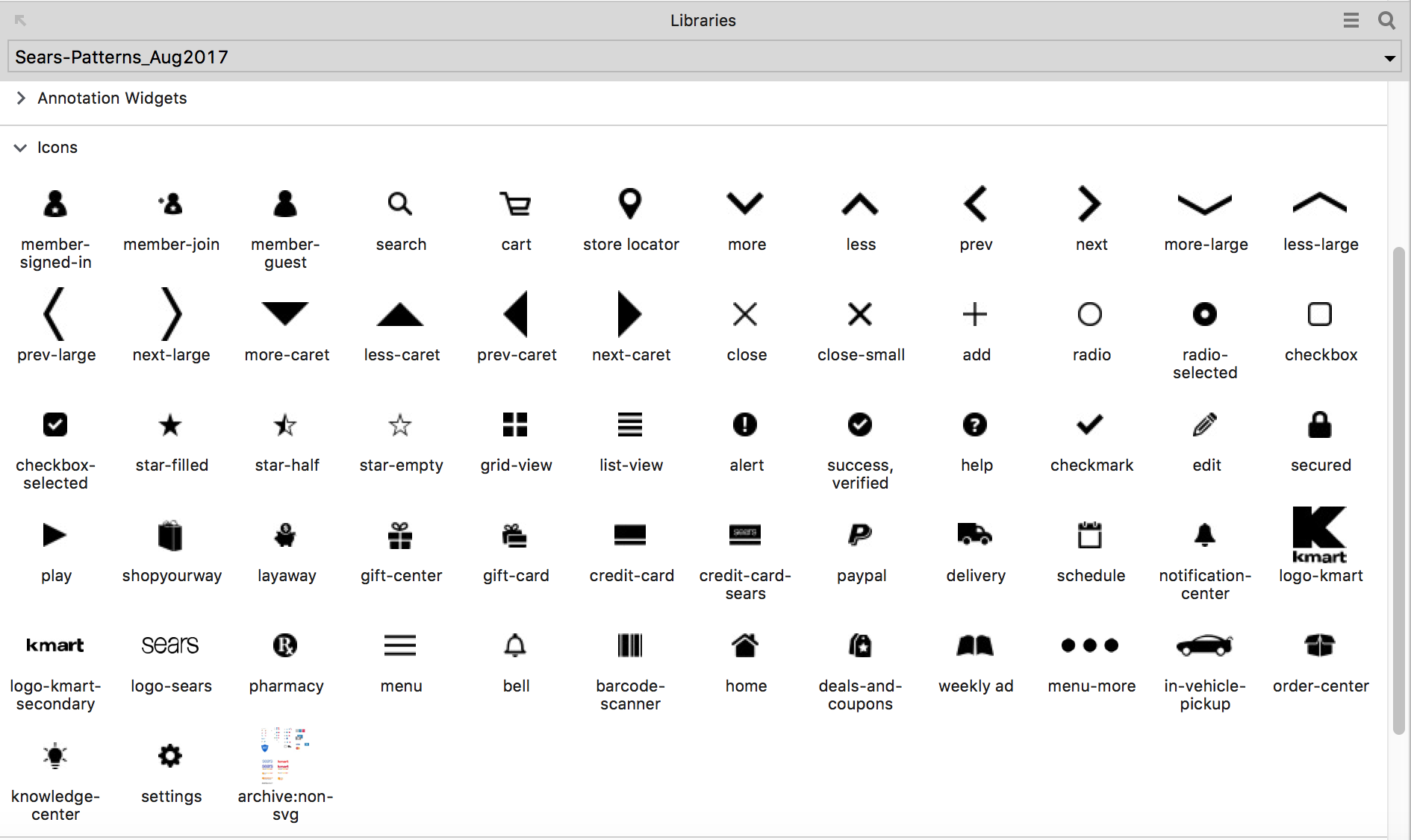
Web pages also use a lot of icons, but not all formats are supported by Axure. So I collaborated with a visual designer to get the original files of all the icons being used in our site, which then I made edits and converted to SVG format via Illustrator so I could import them to Axure. As a result, the new enterprise widget libray has an icon section with over 60 icons that can be simply drag & dropped for wires and prototypes.
2. Organization
Next step was to organize the content of the widget library to make it intuitive so the users could easily understand where to look for in order to find the components or pages they need: Should the components be listed in an alphabetical order or by the numbers of usage? Should we group components by the pages they are used for, or by the categories? There were many factors to consider in organizing the library.
As a problem solving, we ran several feedback sessions with other UXAs, designers, and developers to hear their thoughts, and also ran user testing by giving the flash cards with component or category names on them and asking them to organize in a way that makes the most sense to them.
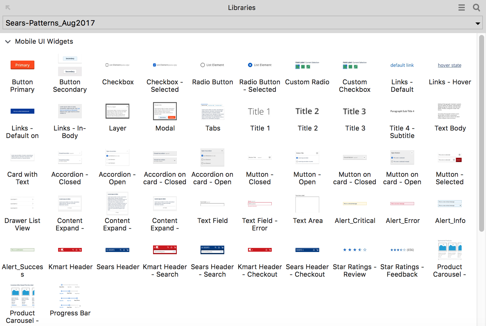
Above is a Mobile UI Widgets section that contains all the individual web components used for mobile and app. For its organization, we decided it would make the most sense to list the widgets in the order of how frequently they are used as that would reduce the search time and the need for scrolling down the library section. In combination to that logic, we also grouped the widgets by categories; primary & secondary buttons, selectors, radio buttons, and checkbox are listed one after the other.
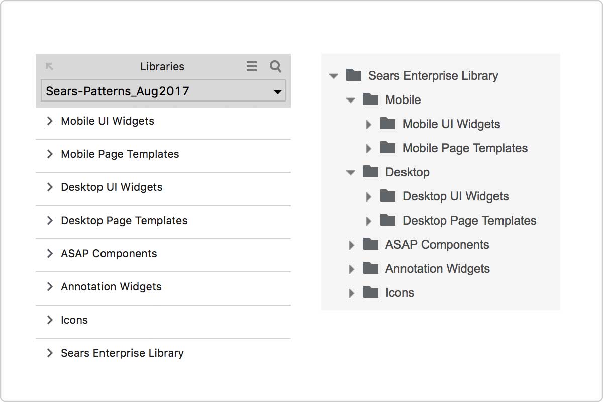
Content hierarchy was one of the main considerations as well. We decided each of us would bring up a proposal and share in a next meeting which we held weekly. My proposal was to start with two main root folders Mobile and Desktop; Mobile folder would have sub folders for the UI Widgets and the Full Page Templates, and the same goes for the Desktop's. As for the orders, UI Widgets would come first followed by the Full Page Templates because we've established in our previous meetings that users would prefer to drag & drop a single component more often than the full page.
Proposals from others included starting with two main folders UI Widgets and Full Page Templates with each having two sub folders named mobile and desktop.
3. Sharing & Maintenance
Final step was to share our produce with everyone. The widget library was uploaded to our enterprise pattern library site and made available to all UXAs and designers at Sears and Kmart. After the official release I've received feedbacks on their experience and thoughts, which were immensely helpful in making a further improvement to the library.
What I Learned
Working on creating a pixel-perfect widget library required for me to go through every single style guide and rule that Sears and Kmart are using. And that allowed me to be very well versed in patterns as well as the conditions and rules that we follow, which helped me greatly in all my future projects. Having an insight in our enterprise patten also led me to perfrom a UX Audit in the future, where I would go through all the profile, bottom of funnel, and top of funnel pages in our site to document the error handlings, and come up with UX solutions to improve the user experience.