Responsive Website
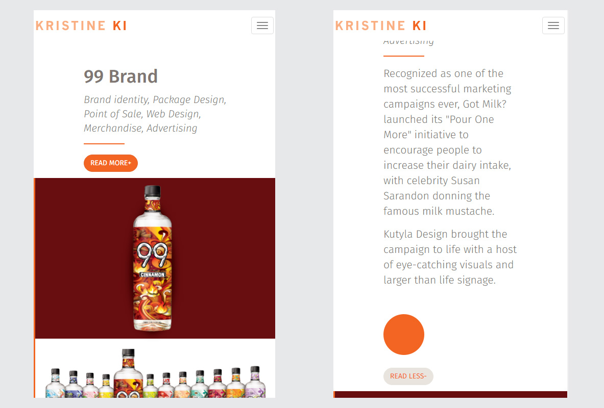
A portfolio website that I created for a Graphics Designer, Kristine Ki. The website is fully responsive, which makes it rescales and changes its display and layout based on the screen size of the device.
web development ⋅ web design

A portfolio website that I created for a Graphics Designer, Kristine Ki. The website is fully responsive, which makes it rescales and changes its display and layout based on the screen size of the device.


Every JS script used to make the site responsive and interactive was hand-coded by me. CSS was used to add detailed styles and layouts for the HTML elements.
Thumbnail Hover Effect: Scripts were written to display its title & caption. Although it might look simple, it acutally consists of numbers of elements such as title, caption, + shaped icon, and a white background block. Every mentioned element requires different CSS properties and values for its positioning and styling, which can be a bit complicated than it looks.

Collapse and Expand: For an equally great viewing experience on a mobile device, part of the paragraphs on the website will be collapsed when viewed on a smaller screen, and in place, display a Read More button that the visitors can click to either expand or collapse the content at will.

Sticky Navbar and Dropdown Menu: I thought it was important to keep the navbar visible at any time, and thus fixed its position to the top of the screen to make it accessible even when the page is scrolled down. On a smaller view, navbar links are collapsed and changed into a dropdown menu style.

| Roles | Tools |
|---|---|
| ⋅ Web Development & Design | ⋅ Software: Adobe Dreamweaver CS6 |
| ⋅ HTML & CSS | ⋅ Software: Adobe Photoshop CS6 |
| ⋅ JavaScript | ⋅ Software: Adobe Illustrator CS6 |
| ⋅ jQuery API Documentation | |
| ⋅ JavaScript & HTML DOM Documents |