| Contributions | Tools |
|---|---|
| ⋅ Use Case | ⋅ Axure RP |
| ⋅ Competitive Analysis | ⋅ Pen & Paper |
| ⋅ System Flow | ⋅ Whiteboard & Markers |
| ⋅ Wires | |
| ⋅ Interactive Prototype |
Sears Wishbook
use case ⋅ competitive analysis ⋅ system flow ⋅ wires ⋅ interactive prototype
Project Summary
Wishbook, an interactive digital catalog that shoppers and members can browse to compile their holiday lists. This project was an initiative to bring nostalgia back to the Sears brand, while providing a shopping convenience by letting members shop whenever, wherever, and however they choose.
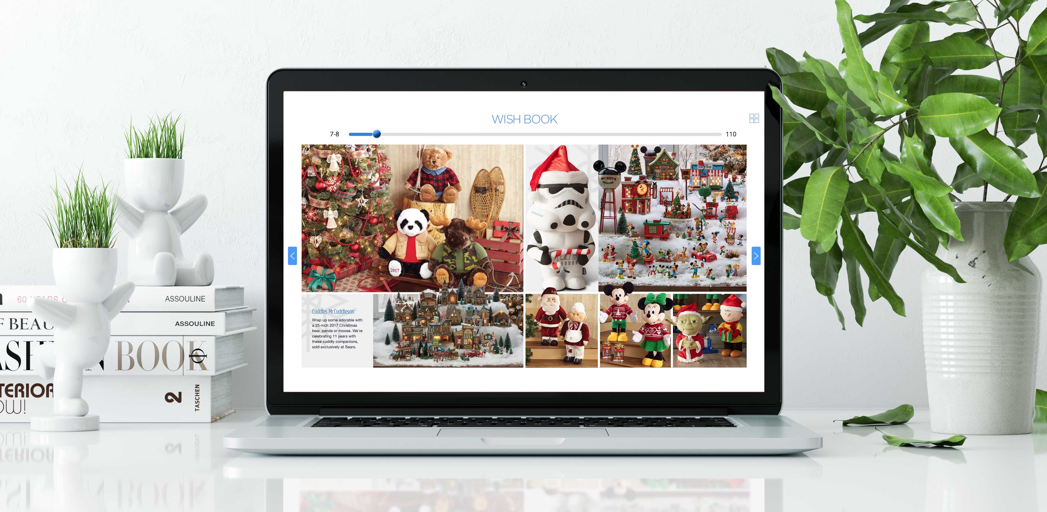
Wires & Interactive Prototype
click to see details (interact with prototype)
As means to demonstrate Wishbook features and flows to the stakeholders, I created a prototype after going through a research on how other competitors have approached their online catalog such as interactions, page layout, navigations, and features.
This project had a slightly different approach from my other works where I'd normally create wires first and then the prototypes. But I built a prototype first this time as I made an earlier start ahead of the official starting date, as well as having an experience working on a similar project, the Weekly Ad. So I already had ideas and insights on how to tackle this project. One other thing that made me try this approach was learning from my past experience that people generally had a better understanding when shown interactive visuals.
Design & Decision Making
Navigation is an important element for a digital catalog as smart navigation means easier finding of the products the users are looking for; they are going to get frustrated and leave the page if they were having difficulties searching the products.
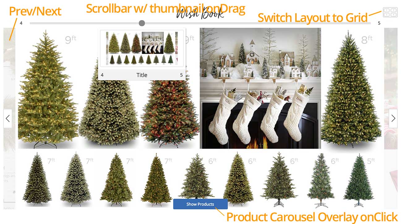
Above shows all the navigation components designed for Wishbook. Left & Right arrow buttons will slide the panel left/right to flip the catalog pages. The whole left and right edges of the catalog are clickable areas for the left/right buttons, easily distinguished by a semi-transparent background which shows you a preview of the previous/next page, allowing users to expect its content.
Horizontal scrollbar navigation allows users to skip through unwanted pages and drop right into the products they are looking for. As a visual indication of the page content, a Hover Module containing a thumbnail image of the page, title, and page # will appear upon dragging a scrollbar; content of the hover module would change dynamically as the user is moving the scrollbar.
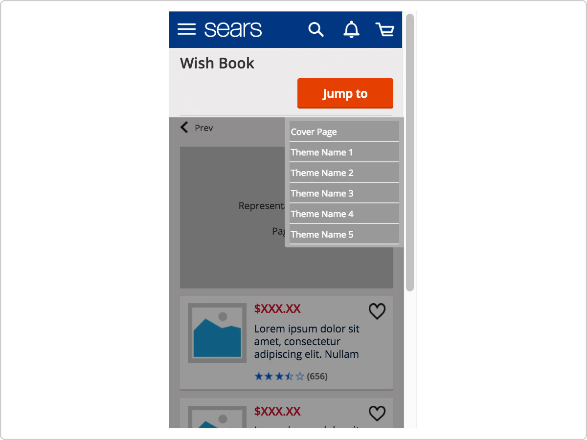
Above is a mobile counterpart of the horizontal scrollbar. Due to its smaller screen size, I used a button in place of the scrollbar; a "Jump to" button would display a drop list with names of the themes. And tapping on the name would jump users to a page with selected theme.
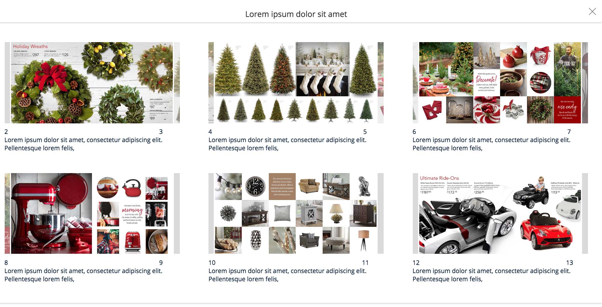
Desktop version also has an option to switch to a Grid Layout. By clicking the icon, the content would change to a grid view with thumbnails, title & description, and page #s. A grid view helps users see the overall content of the catalog which could be a faster way in browsing the products.
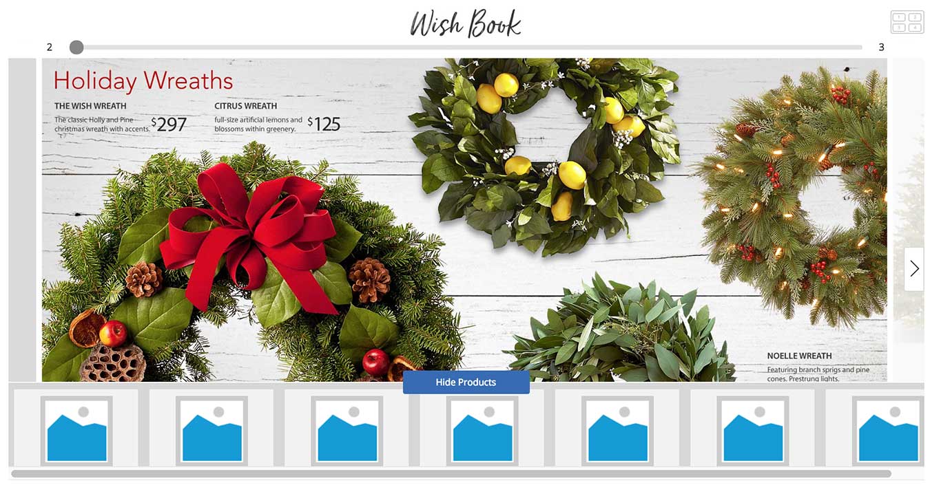
Show Products is a button that's placed at the bottom of the catalog; onClick, it'd bring up a product card carousel that would display all the items that's shown in the current page. Clicking the product card would send users to PDP, a product details page.
This feature received positive response from the stakeholders, but it was ultimately omitted in the MVP, a minimum viable product, due to a lack of development time.
Traffic & Flows
As Wishbook is a newly made digital catalog that wasn't previously present in Sears & Kmart websites, we had to design the flows on how to make Wishbook presence visible to the users and drive them to this page.
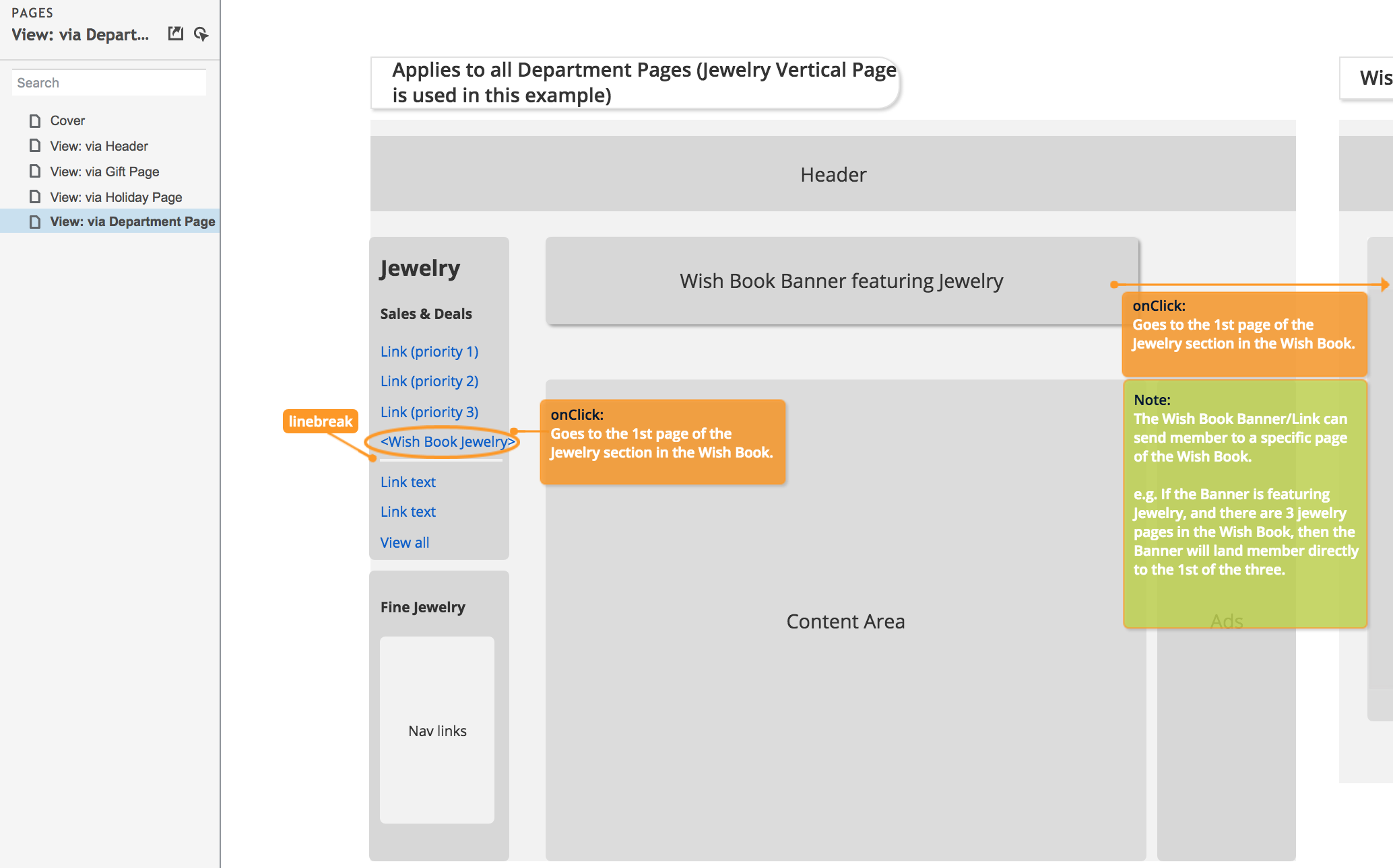
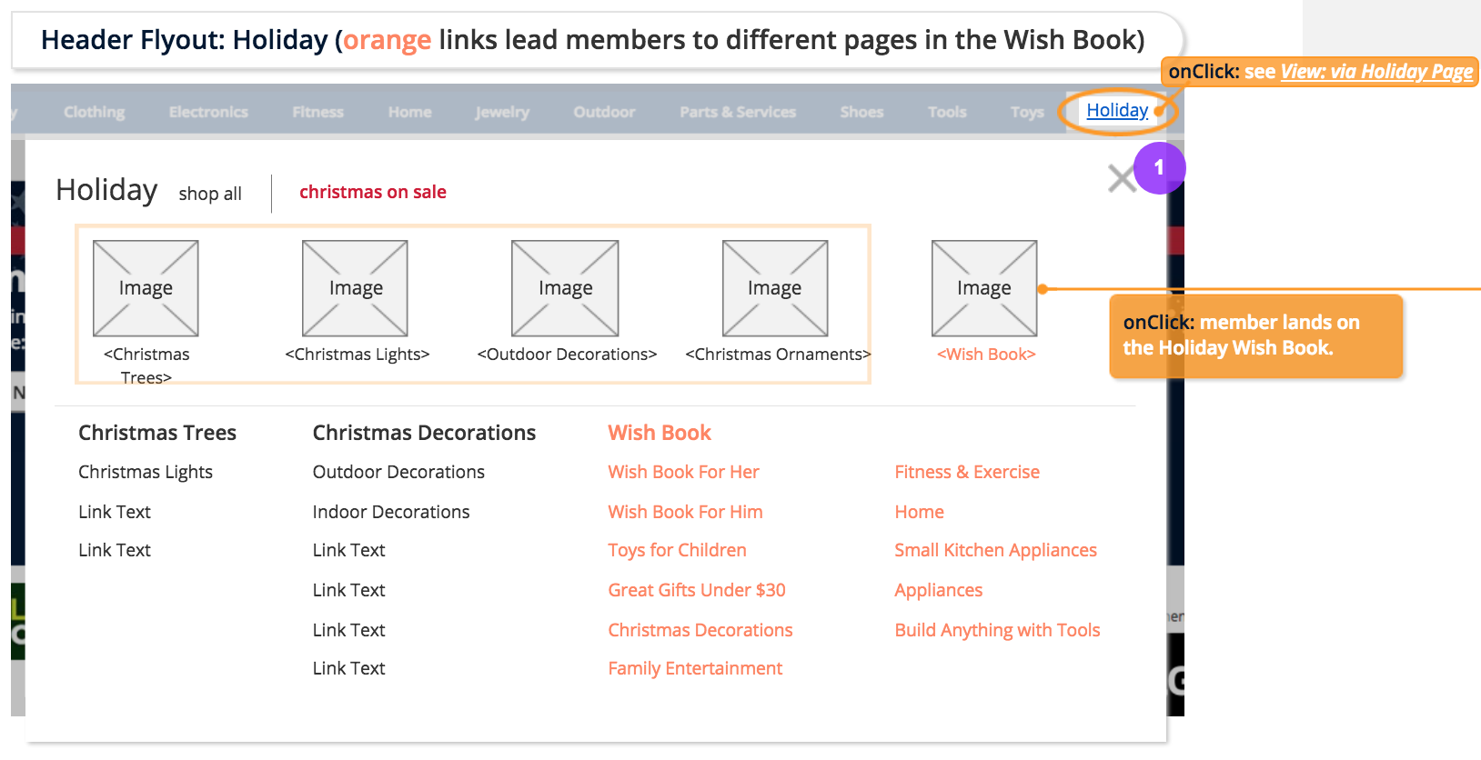
Challenge was that both Sears and Kmart have multiple pages such as deals, seasonal, and products that are owned by different BU teams and stakeholders; each striving to drive the most traffic to their own pages. Associate Principal Architect and I mocked up the wires and presented our proposals to the stakeholders on where to put the Wishbook links or banners throughout the site such as the Header, Deals, Gifts page, and Navigation menus. Then our stakeholders would bring our proposals to other BU teams and our leaderships to negotiate. We went through a bit of a tug-of-war determining the Wishbook placements and its level of presence in other pages. It was a valuable experience learning about the business structures as well as becoming more well versed in the process of proposal and negotiation.
Thereafter
Once the flow, features, and designs were decided, I fleshed out the wires with functional specs detailing the conditions and states for our developers.
Wishbook was launched with success without any delay or issues; seeing the product that I've worked on being shown and talked about in the news channels and other media about the nostalgic Sears Wishbook coming back was a very surreal and exciting feeling. Even more so because the production site both looked and functioned exactly the same as the prototype and the wires that I built.